by Stephanie Evergreen | Jun 25, 2014 | Blog, Dataviz
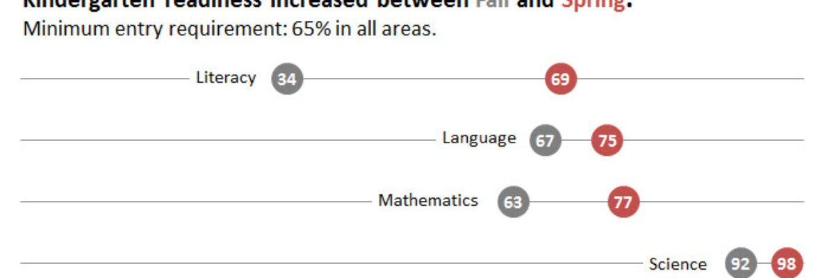
In case it wasn’t clear, I freakin love dot plots. They are amazingly easy to read, beautifully simple in their display. I was making these babies for some clients a little while ago, before and after dots for about 25 variables in one graph. And they said...
by Stephanie Evergreen | Apr 16, 2014 | Blog, Dataviz
Here is what a normal bullet chart looks like: There are usually areas of performance in the background (acceptable/unacceptable, in this case), a target line, and an actual bar the represents your real value. Bullet charts kick ass for showing part-to-whole...
by Stephanie Evergreen | Mar 19, 2014 | Blog, Dataviz
Do you need to communicate your standard deviations to your audience? No, I mean, really DO YOU? Think hard about that because chances are your audience doesn’t give a crap. They want to know you calculated your standard deviations. They want to know you were...
by Stephanie Evergreen | Aug 21, 2013 | Blog, Dataviz
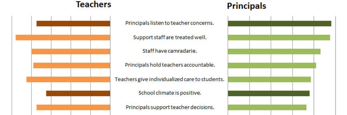
Last week my friend Ann Emery posted a dataviz challenge on something I’d been wanting to figure out for a long time: how to make a diverging stacked bar chart in Excel (I’d also heard of them as sliding bar charts, but getting our dataviz terminology on...
by Stephanie Evergreen | Jul 10, 2013 | Blog, dashboard
We don’t just report the facts, ma’am. We use a set of values to make judgments about the data, like which of these results is good or needs improvement, etc. We set benchmarks and cut points so our clients can understand when action needs to be taken and...