
My New Favorite Graph Type: Overlapping Bars
Why have I fallen in love with this graph type? I think its because its such a great way to visualize the comparison between two things, when one is inherently a part of the other. In recent client projects, I’ve used these to show actual v. budgeted amounts. Or individual v. aggregate scores. Or those we’ve surveyed v. the entire population. Progress toward a goal or against a benchmark. How funny my boyfriend thinks I am v. how funny I really am. You get the idea. AND, best of all, making this graph is a piece of cake.
Your data table will look pretty standard:

You’ll highlight all of this data and insert a very standard, typical, clustered bar chart. One of these:

The trick is to get one set of bars on top of the other, kind of nested inside. To do that, you’ll click on the set of bars you want in front. Then right-click and select Format Data Series. In the box that pops open, click the radio button next to secondary axis.

Moving a series to the secondary axis essentially means it will layer in front of the original series (which is still on the primary axis). The secondary series pretty much occludes your other set of bars, doesn’t it? We want the bars in the back to be wider, so the ones in front look sort of nested inside. Getting the bars wider involves a super geeky technical-sounding Excel move – reduce the gap width. Excel means the width of the gap between two of those blue bars. Why not just call it Make the Bars Wider? I don’t know. Maybe Excel secretly hates you. Regardless, to reduce the gap width, click on the little bit of blue bar you see in the background with the Format Data Series window open. In that same window, you’ll see a slider next to Gap Width. Crank it to the left.

You’ll just have to eyeball the exact gap width until it looks good to you. See how it made the bars much thicker, kind of making them look like the own the orange bars? That’s the idea! We want the visual representation to reflect the relationship between the variables in the dataset.
Moving those original bars to the secondary axis means we also see a second y axis scale at the top of the graph. Make sure the minimum and the maximum of both y axes match perfectly. Then delete the one at the top. It’s ruling the orange bars but its redundant.
Finally, add a better font, some action color, and a succinct title.

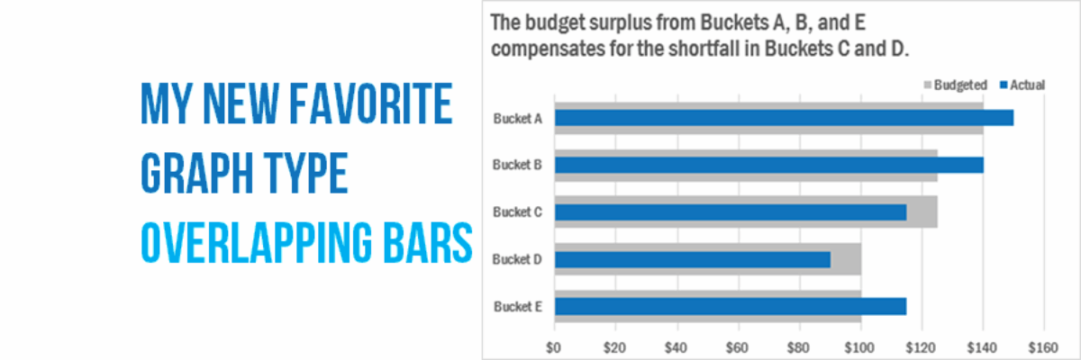
Overlapping bars show surplus and shortfall so well. (What a tongue twister – good thing this is just a blog post.)

Read!
Check out even more useful graph types in my latest book, Effective Data Visualization.
You’ll find at least 4 other ways to visualize comparisons against benchmarks, plus my sought-after Chart Chooser handout.
This second edition even includes the largest collection of qualitative visualization options ever published.
