
Dashboard Icons in Excel
We don’t just report the facts, ma’am. We use a set of values to make judgments about the data, like which of these results is good or needs improvement, etc. We set benchmarks and cut points so our clients can understand when action needs to be taken and where. Yet our presentation of those values and judgments is often unclear. We tend to present just an array of numbers and assume the reader will be able to mentally dig in and figure out what’s good and what isn’t. We can and should present those numbers – we’re into transparency, after all. But the addition of a set of judgmental icons can be a helpful way to quickly communicate where focus is needed.
So let’s say I’m working with a high school Math teacher with way too many students. She keeps track of student scores on homeworks and exams and so forth in a spreadsheet but, as the school’s internal evaluator, she told me she needed something that would jump out at her if students were failing, or on the edge of doing so.
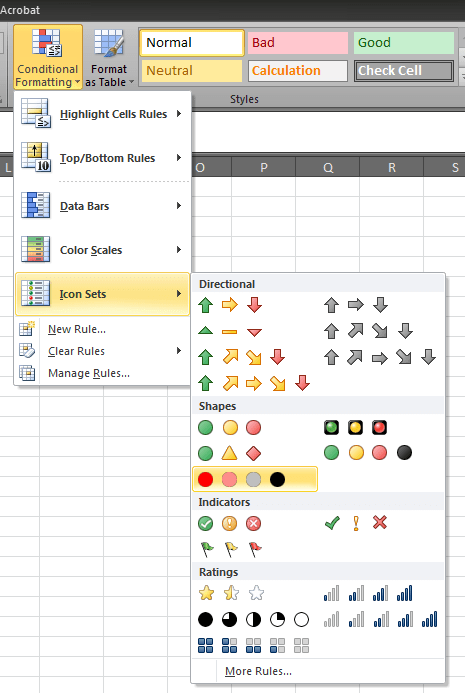
Lucky for us, Excel 2010 has built in a set of judgmental icons that we can use for this purpose:
 Two problems, though. First of all, most of the predesigned icon sets are in the red/yellow/green spectrum, which isn’t helpful to the colorblind. And its kinda ugly (views are my own). That’s why I chose the red to black set of icons. The other thing is, putting an icon on everything in a spreadsheet or dashboard is a sure way to make things overwhelming, fast. Here’s how to fix it.
You select the cells in your spreadsheet for which you’d like to have the icons applied. Then you click you fave set of icons here. Then you Manage Rules. This box pops up:
 And its here that I adjust the scope of icon set and assign the cut points or values where they will apply. I selected no icon for the students with passing grades. I adjusted the range of values so that students near the failing mark (less than 60 and greater than or equal to 50) get a light red circle and those who are failing (less than 50) get a bright red circle.
Applied to the Math teacher’s spreadsheet, it shakes out like this:

Now the icons highlight the average student scores that need attention. I also added in sparklines to show each student’s progression of grades over time. It’s a lot to consider, but the sparklines can give more informative detail than just the average score. Student ID 20, for example, has a bright red mark, indicating failing. But that student’s sparkline shows a generally improving trend since the first assignment. A different remediation approach might be warranted than, say, Student 10, who has stayed flat.
So the strategy here was to add simple, limited indicators to show our evaluative cut points and spur action. As with most things in Excel, the defaults are nice but insufficient and some tweaking will be needed to maximize their benefit.
And speaking of using dataviz in the education world, have you read Sheila Robinson’s recent blog post on this topic? She writes about a cool study that we need to see more of!
I’m hitting the road soon! Check out my upcoming events to see if I’ll be near you. If so, let’s grab a coffee and talk shop. If not, bring me out, why don’t ya?

You can find a lot more step-by-step instruction on how to make awesome visuals in my Evergreen Data Visualization Academy. Video tutorials, worksheets, templates, fun, and community. Excel, Tableau, and R. Come join us.
