The only movie I ever watched on repeat as a youth is My Cousin Vinny. I realize I’m dating myself with this reference.
With the hindsight of today, the movie surely has its problematic moments.
It also has so many golden scenes that have made it a cult classic.
Like this one, where the lawyer is questioning whether a witness was able to get a clear view of the defendants, when there’s a lot of obstruction between the witness’s house and the Sac-O-Suds where the murder occurred:
We, too, put obstruction in our data visualization.
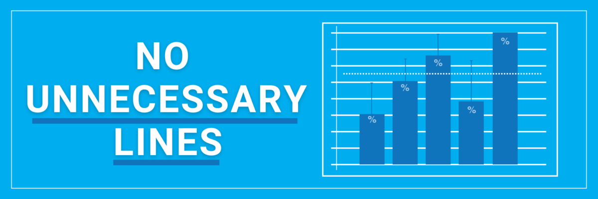
All the unnecessary lines in our graphs are the dirty window, crud-covered screen, the trees with all the leaves, and the seven bushes standing between your audience and your graph. They get in the way of being able to see clearly.
This doesn’t mean *every* line in your graph has to go.
Don’t take this too far!
I put 4 guidelines in the the Lines section of the Data Visualization Checklist so you know exactly what to keep and what to delete.
In sum, no unnecessary lines.
Your job, with the help of the Checklist, is to learn to distinguish between a necessary line and an unnecessary one.
Here’s how you can tell: A line is unnecessary if it doesn’t actually display data or assist reader interpretation.
Create more readability and clarity by deleting unnecessary lines.
Ditch your chart borders.
Eventually your graph is gonna go live in a home. A dashboard, a slideshow, a webpage, a PDF. Right? You want the empty space in the chart to blend in with the background space of the home. You don’t want that space divided up with borders.
Ever hear a graphic designer talk about how much they love white space? Though you may have just nodded along at that cocktail party, now you know what they meant. Not that the space has to be white, just that all the empty space is breathing together, blending.

Delete (or lighten) your gridlines.
The default chart, on the left, has black gridlines. These stand out quite a bit because of how well black contrasts against the white chart background.
But the gridlines shouldn’t be standing out so much because they aren’t the most important part of the graph (the data is! Or the data are! Whichever way you stand on the is/are debate, I still love you).

The revised graph, on the right, is more appropriate. I changed the gridline color to light gray. The gridlines are still visible, to help with interpreting the values of the data, but the gray color relegates them to the background, playing a supporting role, where they belong.
You wouldn’t keep these gridlines at all if you were to add data labels to each point in the graph. If you add data labels, you have to delete your y-axis and the gridlines. Otherwise, we have redundant encoding and clutter.

The value axis + gridlines are a data value interpretation system. So are the data labels. You only need one data value interpretation system in your graph.
Also, let me be clear on this point – since I have a value axis, the gridlines are necessary.

I see cases where people hear me say “delete unnecessary lines” and they go too far and take out the gridlines. But when you do that, people have a hard time estimating the values in the graph. Our eyes need those gridlines to track between the value axis and the visual.
Gotta keep the gridlines if you have a value axis.
Some of y’all will have to go one step further. Some of your software programs automatically add tick marks to your axes. Those tick marks are like the leaves on the trees, adding clutter to the view. They don’t assist with interpreting the data. Kick em out.

Remove the axis lines.
If you decide you’d rather have data labels instead of a value axis + gridlines, it’s totally cool. Just watch one thing.
After you’ve deleted the value axis and those gridlines, be sure the axis line is also gone. It’s often hanging out where your first gridline would have been. Delete, delete, delete. You don’t need that rusty window screen obscuring your chart.

My Tableau friends, that program is THE WORST at adding in unnecessary lines. You especially need to watch out for the row and column pane dividers. 😘
Data visualization is a situation where you have to subtract to add. Subtract the unneeded cluttery lines to add major clarity.
Test your graph on its clarity using the Data Visualization Checklist.
