How to Effectively Present Quotes

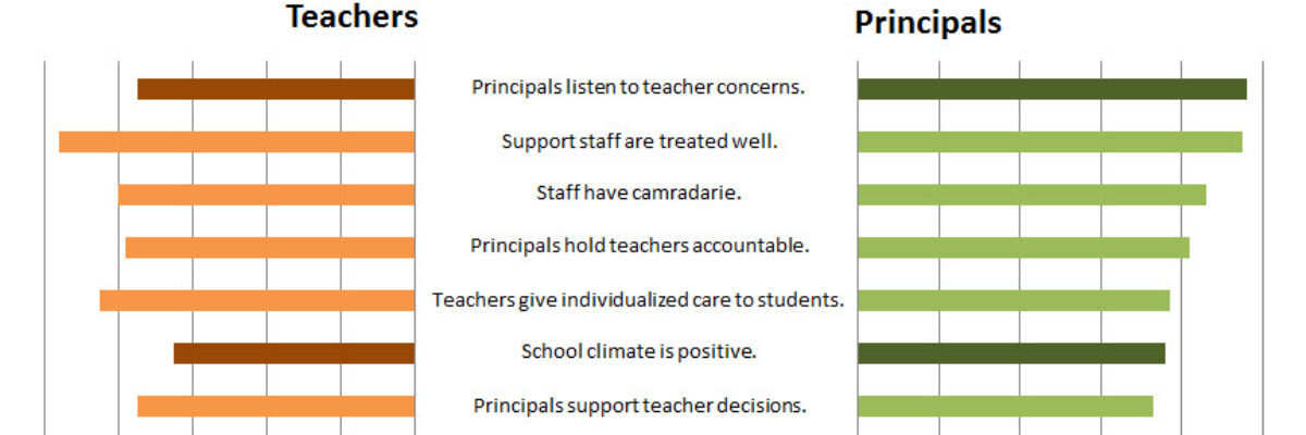
When it comes to qualitative data, we have far fewer dataviz tools at our disposal. Another time, promise, we’ll get into word clouds and what Stuart Henderson thinks of them. Today, let’s tackle a more common method of displaying qualitative data – quotes. In reports, quotes are usually shown…

Read More

Easy Dot Plots in Excel

A while ago I was at a Naomi Robbins’ workshop and she was pretty emphatic that dot plots are the better method of visualization, as compared to bar charts. The reason goes back to Cleveland’s early experiments on visual perception, which found that humans most accurately interpret locations on line,…

Read More

Reviewing Datawrapper

Have you tried out Datawrapper? The Guardian uses it for their data visualization reporting (learned after reading through lengthy but amusing comments and semi-argument on Few’s blog) so I figured it was worth checking out. Datawrapper is primarily used to embed graphics in a website, like…

Read More

Who Can Do Dataviz (or How a Field Evolves)

Wow, the action in the dataviz/tech world this past week has been awesome! A female programmer at a Python (that’s a programming language also used for dataviz) conference was fired after tweeting about the sexist jokes she was hearing from a largely white young male crowd, and Tableau’s…

Read More

Scratch-Off Graphs

A couple of weeks ago, I got an email asking me for ideas about ways to make evaluation findings more exciting and interesting. I know, some of you are thinking, “aren’t they always exciting and interesting???” but alas it isn’t the case. This idea wasn’t appropriate for the emailer’s particular…

Read More

Making Back-to-Back Graphs in Excel

Let’s say we’re interested in comparing how two groups – oh, teachers and principals – responded to a survey. One way to visually display that comparison would be a bar graph, where each question had two bars, one for teachers and one for principals. It’s helpful in some ways, but…

Read More

Bonus Post: Online Data Visualization and Reporting Classes

I’m taking my normal in-person speaking engagements online and you can come. I’ll be presenting one 90-minute class per month and repeating this entire series every 4 months. You’ll even get a sneak peek of examples from my forthcoming book (don’t tell Sage). Here is the lineup: Reporting to be…

Read More

Beer Delivery Visualization

Time to tackle some of the more important parts of life. I saw this delivery schedule in a cooler at a DC Whole Foods. Bell’s Beer is from Kalamazoo and we take pretty big pride in our hometown beer. So we (I mean, I) get really geeked when…

Read More

How to Keep Parents in the Dark

Report card time in the Evergreen household! We have a kindergartener, so this is our first venture into decoding the marks representing his progress. Among other assessments, he’s given a standardized test throughout the year to measure his emergent literacy. Because it looks nothing like the rest of the report…

Read More

Juice Analytics

Zach Gemignani, of Juice Analytics fame, gave the keynote at the AEA/CDC Summer Institute yesterday. I had followed their 30 Days to Context Connection list earlier last year, so I was super excited to witness the fun in person. His keynote speech focused on the 10…

Read More