
How to Effectively Present Quotes
When it comes to qualitative data, we have far fewer dataviz tools at our disposal. Another time, promise, we’ll get into word clouds and what Stuart Henderson thinks of them. Today, let’s tackle a more common method of displaying qualitative data – quotes. In reports, quotes are usually shown something like this:

Usually, there are lots of these, italicized, in a row. The reader is expected to want to slog through each quote and pull out the parts most pertinent to the point the evaluation report author is trying to convey. It isn’t clear which part of the quote is most important, especially when there are several quotes strung together.
In a slideshow, quotes usually appear alone, still italicized, shown while the presenter reads the full quote from the slide.
Quotes are tough – the presenter needs to read the full thing because it fits in with the talk, but the audience is compelled to read the whole thing as well because we like reading words. An improvement would be something like this:

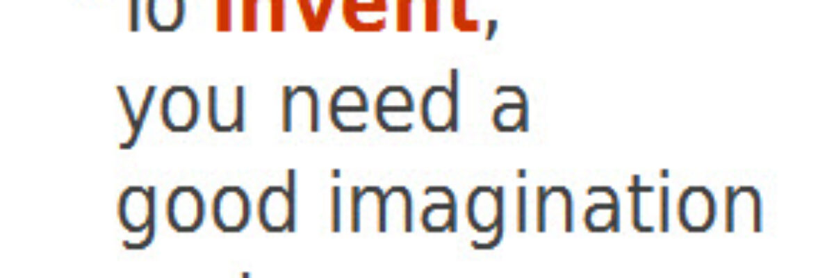
Here I made a bunch of tiny changes that better convey the quote. First, I made line breaks at naturally occurring points, so that each line ends up being a logical chunk. It takes less actual “reading” to read the quote because the eye can pick up an entire line at a time. If I was presenting this in a slideshow, I’d use animation to make each line show up one at a time, just as the speaker speaks it.
I also used a condensed font so the text is less spread out. Yes, I’m attempting to make it so the reader doesn’t have to make much eye movement to read. Sounds trivial but eye movement takes work and cognition, while we want this quote understood at a glance.
Then I added color on selected key words in the quote. It depends on what you want people to pay attention to, of course. If I was focusing on use of imagination in the workplace, I’d have put my color on imagination instead. Two things: (1) Color really has to be selective. One or two key words. Too much color kills the point of emphasis. (2) The rest of the text is in a shade of gray to help the color pop out more.

I could kick this up one more notch by bringing in a photo of the person being quoted. It might not do much here (though isn’t he cute?) but think about adding pictures of interviewees, of program participants, to their quote in your evaluation report. Get permission, of course.
It’s just that adding pictures is a powerful way to elicit some emotion out of the reader and help drive the quote home even more. Imagine this picture/quote combo in your report sidebar – much more impactful and memorable than a string of italicized text.
Qualitative Data Visualization can go far beyond good looking quotes too. Download my Qualitative Chart Chooser for 22 fresh ideas.
