Ever start your eval presentation, peek behind you at the screen, and notice it doesn’t look anything like what you designed back in your office? Or open a report from an email attachment and wonder how your colleague PDFd it looking that way? The issue is typically due…
Communicating Findings
City Branding: Miami
A few weeks ago I was letting the sunshine in Miami love me (well, it was mutual) when my partner commented that Miami really has it’s own color scheme and font, beyond it’s famed art deco architecture. It’s always been a touch puzzling to me when designer people talk about expressing…
Handling Colorblindness
Dealing with potential audience colorblindness isn’t as mysterious as it seems. (And as an added bonus, by way of handling colorblindness, you’ll also fortify your work against the dim bulb in the projector or the color settings on the presenter laptop that skew your established color scheme.) One product,…
Worst Font Contest
Two years ago I ran this tiny contest on my social networking platforms for the worst font ever. Far and away, Comic Sans was the winner. Here are the others that deserved mention, along with the messages they tend to communicate: Jokerman: Also says “Fajitas Tonite!” (spelled with…
Kuler/Color
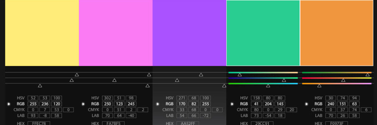
Here’s a procedure I use all the time to help me select color combinations for my reporting. It makes use of this great, free, online program that takes all the scientific color theory stuff and translates it for those of us without a MFA. First, I head to my client’s…
Safe Fonts for Evaluation Reports
Hey peeps, ever get so excited about picking fonts that you try on each one in your dropdown menu for an hour and end up stricken with fear that none of them will work on your client’s computer? I did this just two days ago. And then I pulled out…
Data Viz & Reporting TIG? Meeting at AEA 2010!
Calling all data geeks! There’s work afoot to propose a new TIG (Topical Interest Group) in the American Evaluation Association. We’re having a brief meeting at the AEA conference this year in San Antonio. Meet us at 6:05 on Friday November 12th in the Goliad Room for a short discussion…
Remember This
Data visualization (or information visualization or infographics) isn’t just a sweet way to display your evaluation findings. It is a critical pathway to helping clients actually remember what you said. Blame the brain. Visual processing of information is the dominant method among all the senses – it is called the…
Eval + Comm
It had perhaps less than six words per slide. It had high quality graphics. It had a systematic and consistent placement of elements. But something about the presentation today still bugged the kernel of a graphic designer inside me. The presenter had clearly read some basic literature on slideshow presentations…
Data Visualization and Reporting TIG
Evaluation use is a hot topic, but no one is looking at the role of graphic design. Guidance on graphic design of evaluation reports in the literature of our field is sparse. Typically, discussion of use of evaluation findings (or lack thereof) focuses on types of use (i.e., conceptual, process,…


