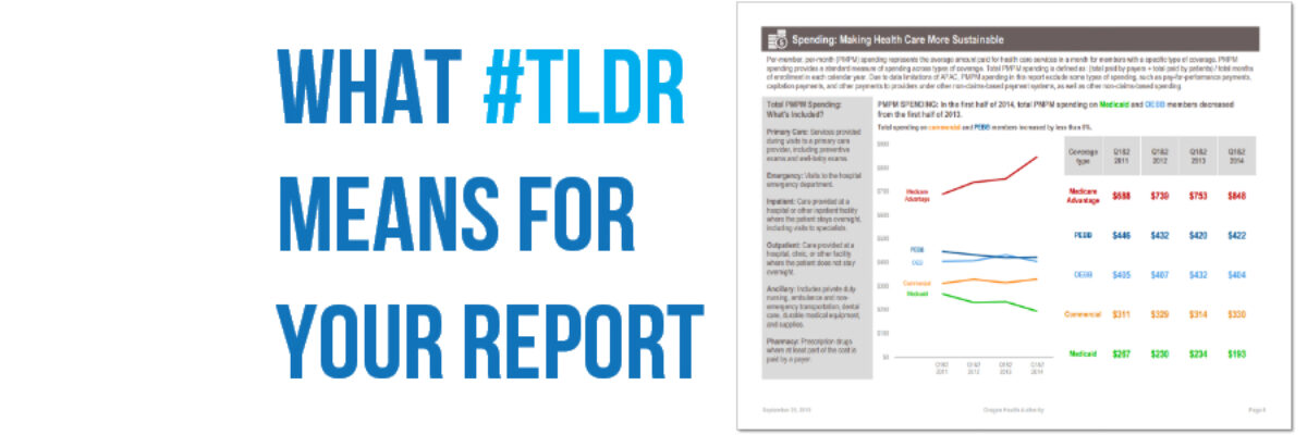
The short answer: It means your report is boring. #TLDR means Too Long, Didn’t Read. And it’s what people say/tweet/think when they get a report that is so long and cumbersome that it’s a burden to read. That said, the long report is not going away any time soon. I…
Communicating Findings
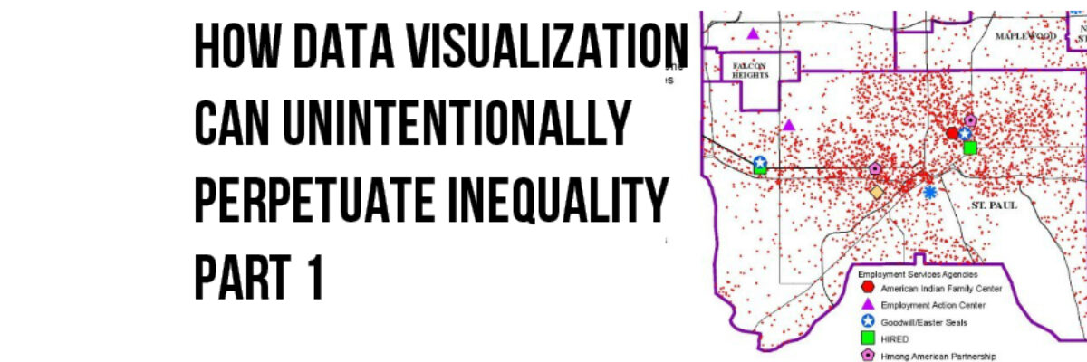
How Dataviz Can Unintentionally Perpetuate Inequality: The Bleeding Infestation Example
Sometimes, whether we know it or not, the choices we make when we visualize data can reinforce and even perpetuate racial disparity and it’s time that we talk about it. The lull of the computer monitor and the belief we are just working with numbers can make us lose sight…
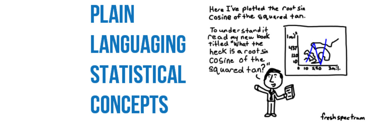
Plain Languaging Statistical Jargon
My main rule of thumb is that you can show measures of variability in your graph so long as you can explain what they mean in an extremely concise subtitle. Translating scientific jargon for a lay audience may be the most challenging aspect of communicating data effectively.
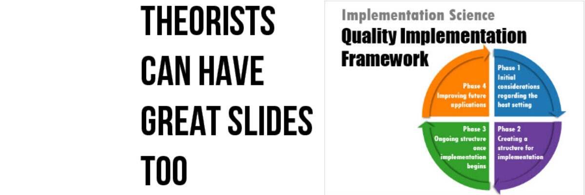
Theorists Can Have Great Slides Too
I have the coolest gigs. Every year I get to work with the Eleanor Chelimsky Forum keynote speaker to develop a slidedeck that rocks the house. This year, the keynote speaker was Abe Wandersman. I’d seen Abe present in the past and… let’s just say I knew…
How to Make a Short Report a Billion Times More Engaging
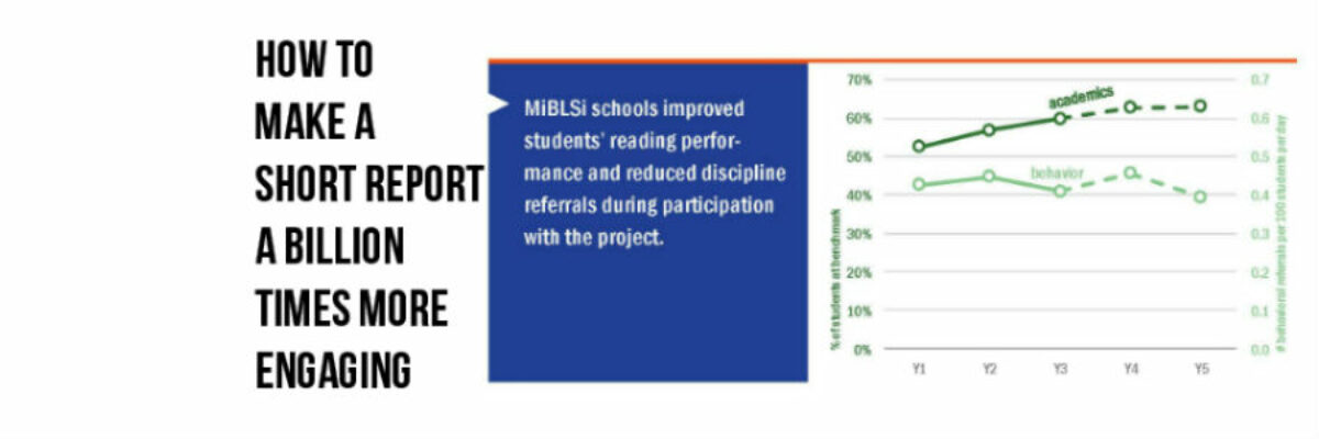
Anna Harms knows when the jig is up. Part-way through my 1 day workshop on Presenting Data Effectively, she knew what change had to happen (and fast). So fast, she didn’t hesitate to walk right up to me and say, “We are working so hard on our reports but there’s…
President Obama’s Data Visualization
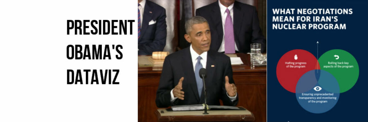
I realize it’s completely taboo to write about current events six months after they’ve happen but I DON’T CARE. One of my favorite events of the year is watching the enhanced version of the State of the Union. Not the regular view – the enhanced view. One side of the…
When I Don’t Mind Radar Graphs
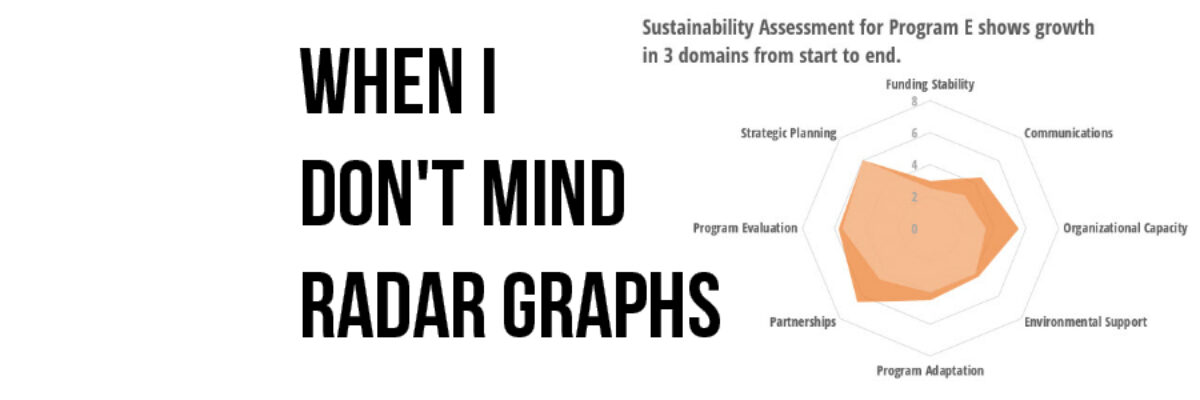
Most of the time, I think radar graph are deployed wrong. They are designed to show percentages along several categories – like a bar graph could – but the axis are distributed around a central point, such that the percentages link together and create a shape. Choosing a radar graph,…
Visualizing Tiny Trends Over Time
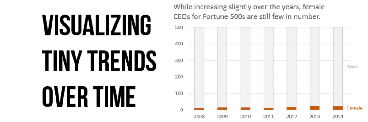
I say: Trend over time? You say: Line graph! I know, that’s how it goes, right? We are so used to seeing trends over time visualized as line graphs that even my 3rd grader can interpret them with ease. But sometimes it helps to have other options that better fit your…
The Most Important Question in Data Visualization
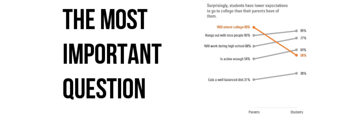
What’s your point? Seriously, that’s the most important question to ask when creating a data visualization. And its the first thing I ask a client who sends me data for redesign. What’s your point? The answers drive nearly everything about visualizing that data. Here’s how that conversation often goes: Client:…
Guest Post: Sid Ali on Visual – Yet Formal – Reports
Stephanie’s Note: So so often I get emails from readers asking for examples of how full reports can incorporate more graphic design while still maintaining credibility and seriousness, especially for more conservative audiences. Sid’s report is a nice example of how well-considered images can boost engagement and appeal. Nice work,…
