Visualize Branching Questions with Nested Area Graphs

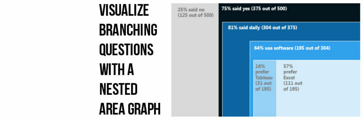
This, my friends, is a nested area graph. I got this idea from the smart people at Innovation Network. And it is super amazing at visualizing the sequence of survey questions that branch. The kind where it says “if you said Yes, proceed to question 32” and stuff…

Read More

Stop Asking if the Slides are Available

The thing is, if the presenter has done a great job, you really don’t want the slides. No really, you don’t. A long long time ago, Garr Reynolds taught me that if someone can look at your slideshow and tell all the things you are going to say, there’s no…

Read More

Guest Post: Chari Smith with a 1 Page Research Summary

Stephanie’s Note: Readers are always asking me for more examples of a 1 page research or executive summary and Chari Smith of CRSmith Consulting has a really nice one here that is visual and yet doesn’t involve a single graph! I have a long history of working with the…

Read More

Data-Driven Decisions in a Fortune 500

More and more, organizations are on board with the idea of becoming “data-driven.” Collecting data on key indicators is a big step ahead from where many organizations used to be. But being able to interpret that data and share it with others in an intelligent way is equally as important…

Read More

How a Dashboard Changes the Conversation

Presenting data effectively changes the kinds of conversations that can happen inside organizations. Better presentations shape an improved culture of decision-making. Let me tell you about a recent example of this. Late 2012 I got a call from an evaluation officer who was working at the Walton Family…

Read More

Choosing a Color Picking Tool

Giant Wes Anderson fan writing you here. So I loved loved loved it when I saw this Wes Anderson Color Palette blog. It’s like several of my happy worlds colliding into rainbows and unicorns. The blogger pulls color palettes from scenes in various Wes Anderson movies. This screenshot is…

Read More

Boil the Lobster Font

I swear to god, I loved this font in early 2013 and now it is everywhere and I want it to die. The Lobster font is/was wicked cute. It’s got personality. It’s friendly. It reminds me of Pinterest. But that’s the thing about fonts – their personality speaks for whatever…

Read More

Finding Fonts & Passing Them On

Sometimes (okay, lots of times) you may find that you need something beyond the default fonts loaded onto your computer. None of these. But other solid, free for commercial use fonts can add the right flavor to your evaluation reports and presentations. My favorite places to…

Read More

City Branding: Chicago

Earlier this summer we hitched a ride on the train to Chicago for a few days to enjoy that beautiful city before it turns blustery and cold for 6 months. As usual when traveling, walking around the city made me think of how it…

Read More

The Font of Truth

No, not the fountain of youth. The font of truth. Wait, could there actually be a font that communicates truth? This little experiment explains that, yeah dudes, that might be the case. Back in July, Errol Morris conducted an experiment. He wrote, as usual, a column for the New York…

Read More