My hot take: Let’s pair a new Census with coronavirus vaccine distribution. A door-to-door campaign. Because Census workers are usually local and trusted and skilled at finding and counting people without doors, too. No doubt, despite the likely incomplete data from the 2020 Census, we will start seeing updated…
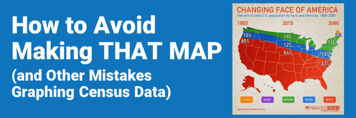
How to Avoid Making THAT MAP (and Other Mistakes Graphing Census Data)
Read More