
Comparing Two Survey Questions in One Graph
You’ve asked employees to rate a bunch of different aspects of their job. You want to know if they think that aspect is important AND how satisfied they are with that aspect of their job. So, naturally, you make two individual questions with response options like Not at all Important to Very Important and Not at all Satisfied to Very Satisfied. I would probably do the same thing.
But then you’ve got to show the data and, importantly, how those two variables – Importance and Satisfaction – relate to each other.
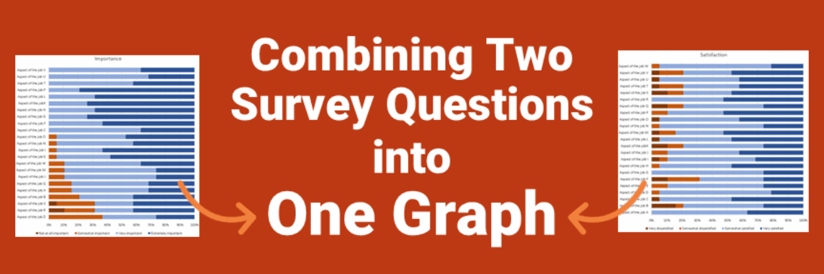
A member of the Evergreen Data Visualization Academy sent me this predicament and her first shot at a visual: the two stacked bar charts below.

It’s going to take a lot of mental gymnastics to flip back and forth between these two graphs and pull out meaningful insights about the relationship between the two variables. This Academy member knew this could be better but just didn’t know where to take it next, so she submitted the question to our monthly Office Hours session, where I fix graphs live on the air.
Like most self reported surveys on satisfaction, the data skew positive. Given that, I recommend we drop the negative responses and focus on comparing the positive, which we can aggregate into one big happy bucket.
Once we are working with just one set of percentages per variable, we can better compare them with something like a back to back chart.

With one variable ordered greatest to least, we would hope to see some kind of pattern in the other variable. No such luck. This actually tells us that there isn’t a strong relationship between Importance and Satisfaction. And that’s a big insight!
If you or your clients want to dig for more meaning, you could keep graphing. Hopefully when I started talking about “relationships between two variables,” you started thinking about correlation and scatterplots.

Scatterplots would let us see individual data points that we might want to explore further, highlighted here in bright blue. We would finish this graph off with an awesome title that directly speaks to the insights found in the data.
Either of these redesigns will help this Academy member launch conversations with her clients so they can make decisions and take actions. And they’ll probably keep hiring her because she helped them get there.
Academy members gets these redesigned visuals and this advice from me as a part of their membership in the Evergreen Data Visualization Academy. In addition to the dozens of video tutorials that show how to make graphs step-by-step, the research articles, the templates, the fun, the community, she also gets ready access to my skills and knowledge.
