My hot take: Let’s pair a new Census with coronavirus vaccine distribution. A door-to-door campaign. Because Census workers are usually local and trusted and skilled at finding and counting people without doors, too.
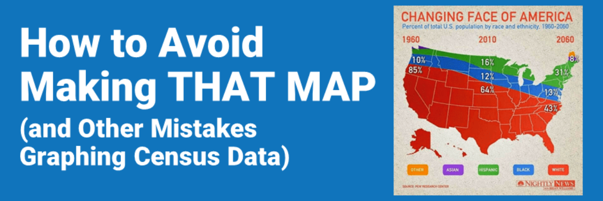
No doubt, despite the likely incomplete data from the 2020 Census, we will start seeing updated graphs that talk about the demographics of our country and estimates of its future. So I’m begging extremely hard that we avoid making stuff like this:

Do you, uh, spot any issues with the way the data are presented in this map? Such as the suggestion that all Asians moved to Canada in 2010 and by 2060 they’ll occupy a sliver of Maine and only Maine? Only White people live in Alaska and Hawaii?? This is so bad it is laughable.
And the danger is in how credibly this was shown to the world. This graphic is sourced to Pew Research Center – a very reputable organization. And was presented on Nightly News with Brian Williams, which, at the time, was very reputable.
Here’s what happened: Pew Research Center had prepared this data as a stacked area graph. Now, I think a stacked area graph is still a weak choice. For example, it can make it look like the Black population is decreasing (the blue stripe in the graphic above) even though the numbers are going up, because of how the White population (the red section in the graph above) is placed at the bottom of the chart.
But then the Nightly News team thought they needed to spice up the Pew data a little more for prime time. So they used a mask feature in a graphic design software to place the cutout map of the US on top of the area graph, obscuring some of the data and adding geographic-racial ties that are inappropriate and hilarious.
Saurage Market Research flipped the layers in the visual to show the stacked area on top of the map cutout so you can kinda see what was going on:

What can we learn from this grand mistake so that we do not find ourselves in similar situations as we make 2020 Census data viz?
Hemingway said, “The most essential gift for a good writer is a built-in, shockproof, shit detector.” and I’d like us to extend that notion to dataviz as well. See, I’m not trying to blame some overworked and underpaid graphic designer, though there was surely one who actually pushed the buttons in Adobe Illustrator to make this visual. There was also an entire production team who saw this visual at some point and let it continue to move forward.
Now, I’ve been fortunate enough to have production teams in my work and I can attest (and my readers let me know) that even when there are many eyes on the same piece of work, mistakes still make it into print. Perhaps, as is often the case for me, everyone was just moving too fast and not slowing down long enough to comb carefully for errors.
Perhaps the people involved did not have sufficiently well-honed data literacy skills to identify a problem. But I’m guessing that somewhere, at least one person had a built-in, shockproof, shit detector and spoke up about the introduction of errors in this graphic. And their objections were dismissed.
Whichever the reason (likely one beyond what I’ve suggested here that is either way more exciting or way more boring), checklists can help us catch mistakes. Checklists request that we pause and review. Checklists request that we obey their authority, bringing power to a situation where some people might feel powerless. “The checklist says you shouldn’t have extraneous decoration in your chart” can spur more corrective action, like it or not, than “I think the map isn’t helpful.”
I’ve combed the research to pull together the Data Visualization Checklist. It has been put to formal tests and used by thousands of people to prevent them from making the mistakes that were made at Nightly News. That map only scored 40.9%.

You can view the breakdown of that map’s score here. Run your own graphs through the Checklist and get help on any points where you don’t score well.
Beyond the visual, let’s also keep in mind who the Census counts and doesn’t count. If you take your Census data timeline back far enough, your dataset will exclude many people. For example, this map conflates population with Census data, absolutely excluding Indigenous people, Black people who were enslaved, and white women. No one in these groups was counted as a person, according to the Census, for quite some time.
