
How I Feel About Slide Animations
Most people fall into one of two camps on this issue: There are the newbies, who use animation with abandon to kartwheel text onto a slide.

And then there are the veterans, who are so sick of kartwheeling they’ve rejected any slide animation on any computer anywhere in the whole wide world. At times in my life, I’ve been in both camps. In my wise old age I’ve softened a little and here’s how.
When the slide has a lot of text
We just wrapped up a Slide Clinic at the American Evaluation Association’s annual conference. Conference presenters could come get one-on-one slide triage prior to presenting from a group of trained volunteers. I saw several patients who were faced with slide after slide of bulleted text. Sure, I told them to add pictures, break it down into one idea per slide, and so on. But some of them had to present the following morning and in the choice between some sleep and a major reworking of the slide deck, they are probably better off with some sleep.

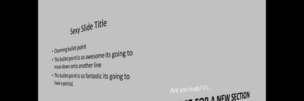
So in those circumstances (and ONLY in those circumstances), the best advice possible is to use slide animation to reveal one bullet point at a time. Note that the ONLY animation forgivable is the Appear, highlighted in this screenshot. Then make sure By Paragraph is chosen under the Effect Options.
This method keeps the audience from reading ahead while trying to listen to you at the same time. It keeps their visual field from being overwhelmed when you change slides.
To indicate a change in presentation structure
Hopefully you’ve started your presentation by giving a rough agenda. When it’s time to shift between agenda topics, it can be super helpful to use visual guideposts that let the audience clearly recognize the turn in direction. Indeed, a literal turn of the slides may be in order.

In all fairness, this technique is actually a slide transition, not an animation. Transitions happen to the entire slide; animations happen to elements within a slide. But the typical transition options can feel just like those annoying rollercoaster animations. One of the few that is appropriate is Rotate, which causes the perspective to move from one slide to the next around a corner. In this screenshot I’m showing the transition in mid-Rotation. It looks a bit crisper on a Mac. Switch, Flip, and Cube could be other reasonable transition choices.
But it’s worth reiterating the purpose of their use: transitions can sometimes be used to indicate the change in major presentation segments. It helps the audience keep mental track of the agenda and notice when the conversation has moved on to something new. Too much is most definitely a bad thing. Of course, there are better ways to use guides (that’s another blog post) but slide transitions are an option when you’re up against a wall.
I may get kicked out of the Cabinet of Presentation Experts for saying so, but some PowerPoint tools can be used. Wisely.
When else is it okay to use an animation? Ever? Leave a comment.
Join me for our upcoming webinar course on slide design.
