At this time last year I was putting the final touches on my dissertation manuscript format and preparing for my defense. I looked at the extent of graphic design use in evaluation reports. I gathered about 200 summative evaluation reports from the repository at Informal Science Education, trained a group of raters on the best practices in graphic design, and had the raters examine a sample of reports. We are essentially doing a product evaluation, with reports as the product.
I’m inspired to tell you a little bit about my study because the International Development Research Centre just went through a similar process and published their findings. They piled their organizations reports together and examined their use of proper data visualization techniques. But they extended the evaluation a bit further and brought in a data visualization expert, who wrote an analysis and published selected redesign visualizations from the stockpile. It’s awesome to see organizations taking their communication so seriously.
My study went beyond data visualizations to look at reports as a whole. Elements like typeface choice and use of color can impact readability (and credibility) and should be examined just as closely. I saw some cases where the (well-done) data visualizations were all grouped in the report’s appendix, rather than placed alongside their narrative text in the report body. Such practices impair information retention for readers.

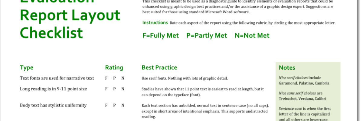
With an extensive literature review of cognition-based design theory and the iterative input of a panel of graphic design experts, I pulled together a checklist of graphic design best practices, as applied in the context of evaluation and research reports.
I trained the raters in my workshop at the American Evaluation Association’s Summer Institute and then asked them to apply the checklist to a sample of the evaluation reports I’d culled.
What we found probably won’t surprise you too much. The reports scored high on checklist items that are default settings in most word processing programs (use of black or very dark ink for narrative reading, white or very light background color – yet we must include those items because some reports did not follow those legibility-focused principles).
The reports scored low on the presence of graphics at all. Graphics, in this case, referred to pictures, diagrams, charts, or graphs. Yep, some reports had no graphs at all. Others, still relying on default settings, produced cluttered and miscolored graphs that caused confusion for readers.
It sounds all negative but there were actually several reports that really got it right and produced engaging materials we wanted to scroll through, regardless of report length.
So those were the main findings of the study but in the process of conducting it we discovered something else: We used interrater reliability to look at how closely the trained raters matched my scoring of the sampled reports. It was high. In other words, with some training and maybe a splash of predisposed interest, people can learn what great (and not-so-great) report design looks like. Some folks like to claim that I have some innate talent or creativity but I don’t think that’s true. It can be learned. You can do it, too.
