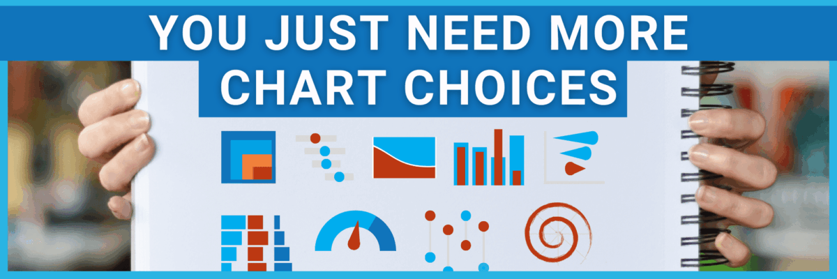
You Just Need More Chart Choices
In my 15 years of experience working with many different organizations all over the world, I’ve seen a pattern: Most institutions already have the talent. You 100% have the ability to figure this out.
And you already have the software (even if all you’ve got is Google Sheets). There’s no need to spend tens of thousands on a new software license. You can make stellar, compelling graphs with the software you already own, whatever it is.
Truly, my experience has shown me that people just need to expand their bench of possible chart types.
And even this isn’t really your fault. We’ve been led astray by the software itself. Each of them will give us a menu of chart choices that we, naturally, consult.
Even though these default chart choices are… bad.
Excel still, in 2025, includes 3D chart options. So it doesn’t come as much of a surprise that we still see people use 3D charts, even though they’re so difficult to read.

You think if you learn fancier software, this gets better?
It doesn’t. Here are the default chart choices presented by Power BI. The icons themselves look like they were made in MS Paint.

The circular charts (pie and donut) look like stop signs.
This is actually a bit misleading in that some of these aren’t chart choices, they’re just buttons to connect you to a different software. And this lot includes bad ideas like funnel charts.
You think if you spend a couple grand on Tableau, things will improve?
Tableau’s default options include some terrible ideas (bubble charts). And this lacks some great chart choices you should absolutely be using – I’ll get to those in just a sec.

Not to mention the learning curve it takes to figure out new software, right?
Some of you may have pushed the easy button and moved over to Canva. Here are the chart options available there.
Canva does make it much faster… to make terrible charts.

You shouldn’t let your software dictate your toolbox.
When we only consult the list of chart choices in our software, we limit our creativity and storytelling capacity.
Let me suggest some swaps for your chart choices.
Need to convey a single percentage? Increase the impact with an icon array.


Rather than two pie charts, make comparison easier with an eye-popping proportion plot.


Kinda hard to detect much of a story in this color-coded table.

But when we swap rate for rank and create a bump chart, so many stories pop out.

You could replace “Chart Title” with “COVID was the 3rd leading cause of death for Hispanics.” or “Stroke only appeared in the top 8 causes of death for Asian/Pacific Islanders.” or “Accidents and Unintentional Injuries was the top cause of death for nearly everyone.” or “Intentional Self Harm is the 4th leading cause of death for Whites.” Much easier to see any of these stories, and more.
The point is, different chart types help us tell better stories.
And you can make any of these using the software you already own.
You just have to ignore the default options presented to you and learn how to hack the software so it produces the charts you actually need.
How? Of course you want to know how. I have the step-by-step instructions for how to make any (good) chart using Excel, R, Tableau, or Power BI. (I’ve even got some help for Google Sheets.)
It’s all inside the Data Visualization Academy.

I’ll also hook you up with my Four Step Visualization Process, a guide to figuring out exactly what your audience wants, and monthly feedback sessions.
Once you join, you’re in for life.


