The myth: Your job is to design a great study, analyze the data, and then share it. Preferably in a journal article. That others will have to pay to access.
Blog
Exploration vs Explanation
Explanation is where you tell the story in the data you saw during exploration to other people who are not explorers.
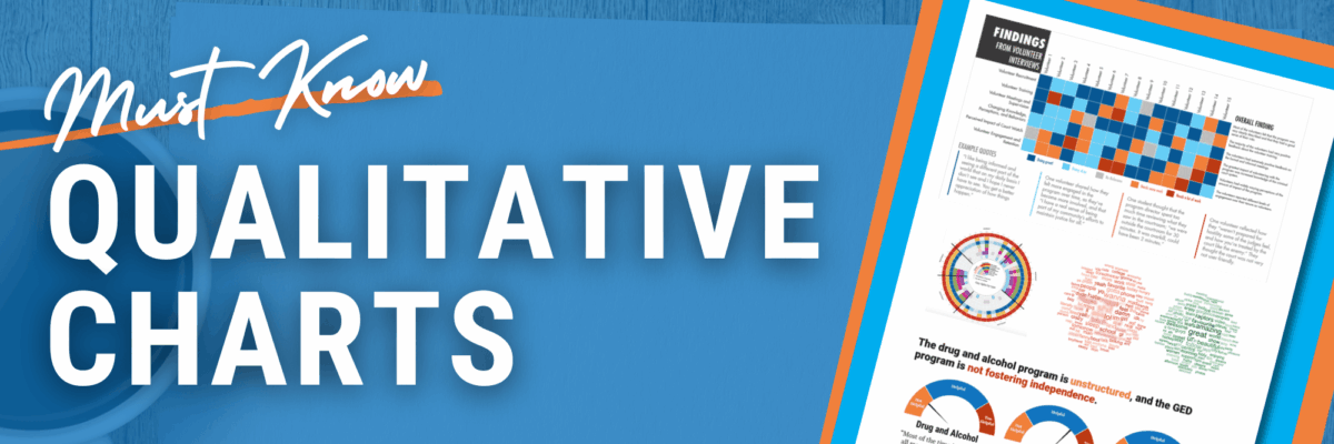
Must Know Qualitative Charts
Wanna learn about my favorites? Adding these visuals to your knowledge bank will give you new ways to tell stories and get people engaged with your data.
Quant and Qual
Tell me if this sounds familiar. Back when I was at the university, doing research full time, we’d produce reports where the front contained all our quantitative results and the back held our qualitative findings. We coulda been talking about the same themes in both sections but it was up…
So Your Viz Flopped…
When I was in middle school, a cool girl invited me to her birthday party at the country club. I wanted to impress, so bad. This was not my place. These were not my people. But I was gonna try. So, after luscious cupcakes, I climbed the ladder at…
The 3 Second Rule
The 3 Second Rule is a major orienting principle that guides the way we make graphs at Evergreen Data. Because our goal around here is to make graphs that are so freakin good, people quickly grasp what we’re laying down and they want more. You probably have that goal too.
Questions to Ask When Examining a Graph
Does the story told in the headline match the data used to bolster it? It’s really common for people to read a tweet and take it as the truth. Especially when it comes from official accounts like the White House. And while the Trump White House was notorious for it’s…
When to Viz
One of the biggest barriers to making great data visualization is the time it takes to do so. But that’s typically because we wait to start visualizing until it’s late in the game. This post is on when to viz. The Typical Data Visualization Process Let’s say you want to…
Better Posters
I have a big ask. I want you to set aside three and a half minutes of your life (I know that’s a gajillion years these days) to watch Mike Morrison. I promise, he’ll make your heart sing. Mike’s right. The way we talk about data has to change.
Graphs Need a Personal Bubble
You know that one friend who is otherwise nice enough but he stands inside your personal bubble? Like, even before the pandemic, he just needed to take one healthy step back. You’re cool, you’re just up in my space. Right. Just like you want a little breathing room,…
