The next time someone asks me how good data visualization actually contributes to a better bottom line, I’m going to retell this story. Some time ago, I sat in a meeting with 11 other people. We were reviewing evaluation findings, presented via charts, which were created by another…
Blog
What Bad Grouping Looks Like
Toy designers beware. Do not put your products into my little dude’s hands because I am an ex-teacher AND now I’m a professional evaluator AND I care about design. Look, just LOOK, at this deck of cards my son came home with. Notice the problem (aside from the…
Eye Gaze & Image Placement
I went to my favorite city in the world a couple of weeks ago – Washington DC. Of course, I didn’t have enough time to explore everything I’d wanted, which included the new Museum of African American History and Culture. But I did catch the promotional signage in the Metro…
Moving Emphasis
As much as I advocate for minimalistic slide design, sometimes that just can’t happen. Sometimes you’ve gotta have a lot of words or a logic model or diagram to show. I previously showed one strategy for handling this – the Slow Reveal. But incrementally revealing parts of a complex…
How to Keep Parents in the Dark
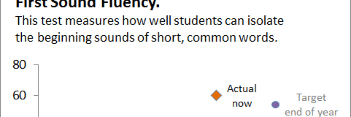
Report card time in the Evergreen household! We have a kindergartener, so this is our first venture into decoding the marks representing his progress. Among other assessments, he’s given a standardized test throughout the year to measure his emergent literacy. Because it looks nothing like the rest of the report…
I Can Make A Window in Plain English
I can make a window to discuss your parallel logistical innovation. Sound familiar? Didn’t some evaluation colleague say this at the conference this past year? Did *I* say this at the conference last year? Nope. It is a randomly generated bit of gobbledygook from…
Icon Construction
Icons or symbols are an “easy” way to organize information throughout an evaluation report. I say “easy,” but I really mean easy for the reader. Symbol sets provide mental organizational structure. They often aren’t so easy for the report author, though. Usually it can be difficult to find a set…
Handling Colorblindness
Dealing with potential audience colorblindness isn’t as mysterious as it seems. (And as an added bonus, by way of handling colorblindness, you’ll also fortify your work against the dim bulb in the projector or the color settings on the presenter laptop that skew your established color scheme.) One product,…
Slow Reveal
Most of the time I advocate for replacing words with images when presenting slideshows. But sometimes the slide just needs to have a lot of words, like this: But when we have a lot of words on a slide and we’re truly trying to get people’s…
