Here’s what happens to audience brains when presenters speak while showing text-heavy slides. Their working memory gets overloaded. Working memory is that part of the cognition system where we contemplate information, wrangle with it, try to digest it. But working memory has limits on its cognitive load. It can only…
Blog
Easy Dot Plots in Excel
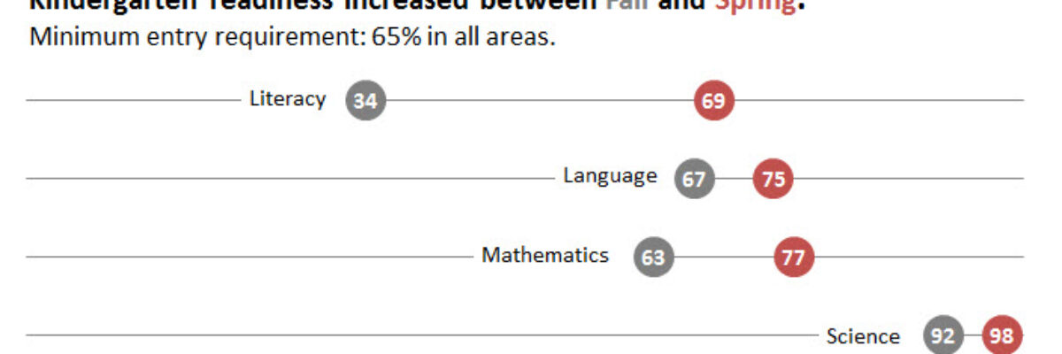
A while ago I was at a Naomi Robbins’ workshop and she was pretty emphatic that dot plots are the better method of visualization, as compared to bar charts. The reason goes back to Cleveland’s early experiments on visual perception, which found that humans most accurately interpret locations on line,…
Guest Post: 5 Tips for Creating Effective Visual Summaries for your Reports
Oh yeah – it’s my first ever guest post! I’m so happy to host Elissa – she does fantastic work. -Stephanie My name is Elissa Schloesser with Visual Voice, I’m a freelance graphic designer specializing in communicating complex information and ideas. I work specifically with mission-based organization, and partner…
Reviewing Datawrapper
Have you tried out Datawrapper? The Guardian uses it for their data visualization reporting (learned after reading through lengthy but amusing comments and semi-argument on Few’s blog) so I figured it was worth checking out. Datawrapper is primarily used to embed graphics in a website, like…
Who Can Do Dataviz (or How a Field Evolves)
Wow, the action in the dataviz/tech world this past week has been awesome! A female programmer at a Python (that’s a programming language also used for dataviz) conference was fired after tweeting about the sexist jokes she was hearing from a largely white young male crowd, and Tableau’s…
Successful Webinar Presenting
I host or give roughly 70 webinars a year, most over with AEA and others right here at Evergreen Data. Here’s what I have seen that makes for a good webinar presentation experience (as opposed to presenting the same content in person). Use a faster pace.
Top Four Mistakes Seen in Conference Presentations
With my book manuscript and an edited volume of New Directions in Evaluation (on dataviz) due this Friday, this week’s blog post is a repost from an original article I wrote for Presentation Magazine. My background is a garbled mouthful: interdisciplinary program evaluation. What does that even mean? It…
Presenting Graphs with the Slow Reveal
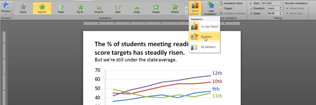
Over here I talked about how important it is that we gradually introduce components of complex graphics – one-at-a-time – so as not to overwhelm the visual field and working memory of our audience members. We don’t want to slam our content in their faces all at…
Scratch-Off Graphs
A couple of weeks ago, I got an email asking me for ideas about ways to make evaluation findings more exciting and interesting. I know, some of you are thinking, “aren’t they always exciting and interesting???” but alas it isn’t the case. This idea wasn’t appropriate for the emailer’s particular…
Slide Redesign: Rodney Hopson’s Keynote
I had the joy of working with Rodney Hopson, 2012 President of the American Evaluation Association, on the slides for his keynote talk. The transformation was so huge that I asked Rodney if I could write a blog post about it and the thinking we put into the new design.
