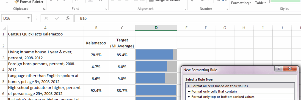
Here is what a normal bullet chart looks like: There are usually areas of performance in the background (acceptable/unacceptable, in this case), a target line, and an actual bar the represents your real value. Bullet charts kick ass for showing part-to-whole relationships for single data points,…
Blog
Largest Photo Service Gives Images Away for “Free”
Last month the world’s largest photo service announced that it would be giving away it’s photos for free. Say what?? Well, it was something like that. Get excited, but not too much. Getty Images announced that a portion of its gigantic, high-quality collection would be available at no cost. Sounds…
Adding Standard Deviation to a Dataviz
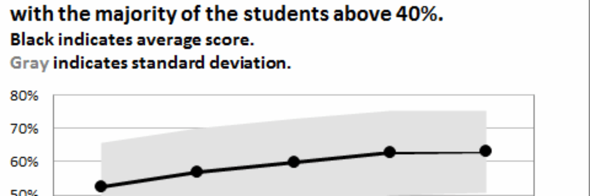
Do you need to communicate your standard deviations to your audience? No, I mean, really DO YOU? Think hard about that because chances are your audience doesn’t give a crap. They want to know you calculated your standard deviations. They want to know you were meticulous in your number crunching.
Boil the Lobster Font
I swear to god, I loved this font in early 2013 and now it is everywhere and I want it to die. The Lobster font is/was wicked cute. It’s got personality. It’s friendly. It reminds me of Pinterest. But that’s the thing about fonts – their personality speaks for whatever…
Findings Cookies
If food can get people to meetings, maybe it can get people interested in evaluation findings, too. Introducing, the Findings Cookie. The recipe is pretty straightforward, though you’ll want to adjust the number of servings for your audience. I messed up a lot on the first several, so…
Data Nerd Valentine’s Cards
Is your sweetheart a little on the data nerd side? I mean, aren’t we all? Here’s the perfect way to show your honey how much you appreciate him or her – even when buried in a statistics book. Data Nerd Valentine’s Cards. Like my Data…
Guest Post: Using Visual Communication to Increase Evaluation Utilization
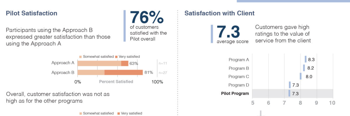
Hi! I’m Nate Wilairat with EMI Consulting in Seattle. We work with cities and utilities to evaluate energy programs and policies. I just started a data viz blog called Skopia. This blog post presents a few lessons learned from a successful effort to develop executive summaries for one of…
My 2013 Personal Annual Report
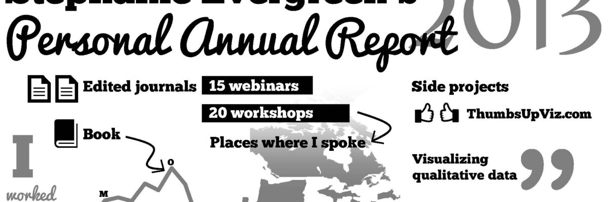
Holy crap, 2013 was a busy year! Look what I’ve been up to – and click around: [gview file=”http://www.stephanieevergreen.com/wp-content/uploads/2013/12/AnnualReport2013.pdf”] So, to recap, I’m prrrreeeetttttty sure I don’t have to publish one more thing until 2015. Whew. Some technical notes: Last…
Before & After: Jody Fitzpatrick’s Presidential Keynote Slides
I get the lucky privilege of working with the president of the American Evaluation Association on his or her keynote slidedeck. I love this small project each fall for a couple of reasons. Thus far, the presidents I’ve worked with have been wicked smart and eager to see the field…
Data Nerd Holiday Cards
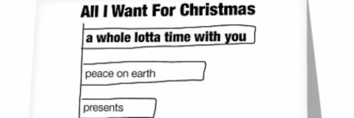
Do you sit around with your data nerd friends and come up with funny statistics- and data visualization-based jokes? No? Maybe it’s just me. But to your benefit! I illustrated those nerd jokes and put them on holiday cards, available on Redbubble. Click the pic to go shopping. Here’s…
