My 2014 Personal Annual Report

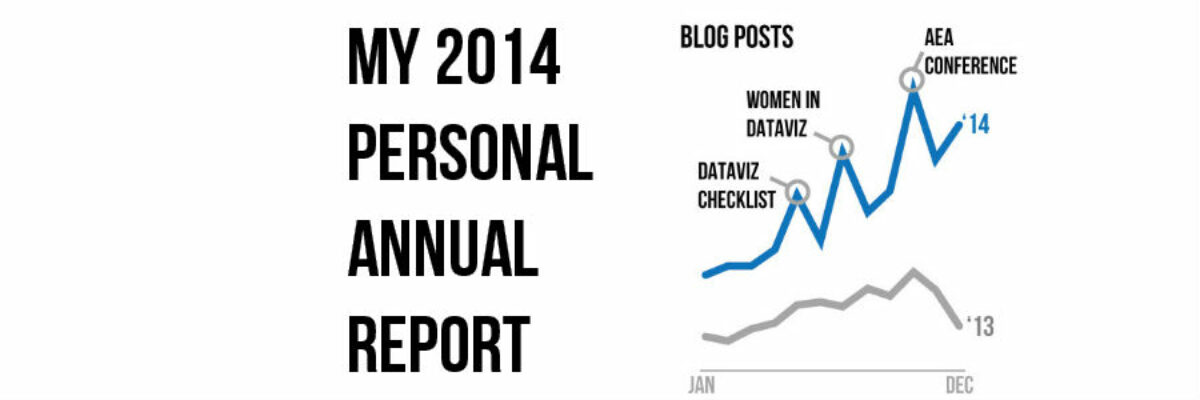
Holy smokes it’s been a big year! I finished up my last workshop of 2014 last week and as I got into the cab to head to the airport, a wave of major sleepiness hit me hard. I’ve been super crazy productive and worked with some of the most amazing…

Read More

Customizing Colors in Excel

Few things scream “I didn’t try very hard” more than using the Excel default color schemes. Good news is that changing them up isn’t really very hard at all. First, decide what other colors you would like. Maybe pick something from your organizational brand. I used ColorBrewer to come…

Read More

Directly Labeling in Excel

It’s time to ditch the legend. You know – the legend, the key, the thing to the right of the graph that tells the reader what each piece of your graph means. We don’t need it. Legends are actually hard for many people to work with because they put a…

Read More

Visualizing Likert-type Data: Try Aggregated Stacked Bars

Man, do researchers love Likert-type data! You know what I mean – the kind of survey response options that range from Strongly Agree to Strongly Disagree (or vice versa, depending on your allegiances). Probably the most common way of visualizing that data is via a stacked bar chart, just like…

Read More

When It’s OK to NOT Start Your Axis at Zero

UPDATE: This post was written in 2014 and my thinking has evolved since then. Here’s the newest post on how to handle all of your axes. You can also join us at the Evergreen Data Visualization Academy where we banter back and forth about these ideas and apply…

Read More

Announcing The Rad Presenters Podcast!

I know some really rad presenters. One of the raddest in Jon Schwabish, which is why I’m absolutely thrilled to launch a brand new podcast with him. The Rad Presenters Podcast! Each episode we will cover a new topic related to presenting – picking great images, the array…

Read More

Evergreen Evolving

I took a deep breath and I did it. I changed my Twitter handle. This is a big deal. Things sure are evolving around here. It goes like this: I fell into the field of evaluation. Like most people on the planet (including my parents), I had no idea what…

Read More

Death Penalty Graphics

What kind of imagery do you use when talking about the death penalty? I was out west a few months ago, working with Rakesh Mohan and his army of awesome. In the past, I had pressured them to use graphics in their reports and slides. And they did! Only the…

Read More

Declutter Dataviz with Small Multiples

Are you making graphs that look like this crap? I won’t make you raise your hand. But let’s just agree not to do this, yeah? It’s SUPER hard to compare the tops of a bunch of bars. Two side by side bars per region ain’t so bad but beyond…

Read More

The Easiest Way to Make Bullet Charts in Excel

There are lots of ways to make bullet charts, some easier than others, some better suited for specific visualization contexts. Hell, there are plug-ins you can purchase that make it a snap. Except when my plug-in broke and I had to remake about a…

Read More