What kind of imagery do you use when talking about the death penalty? I was out west a few months ago, working with Rakesh Mohan and his army of awesome. In the past, I had pressured them to use graphics in their reports and slides. And they did! Only the…
Blog
Declutter Dataviz with Small Multiples
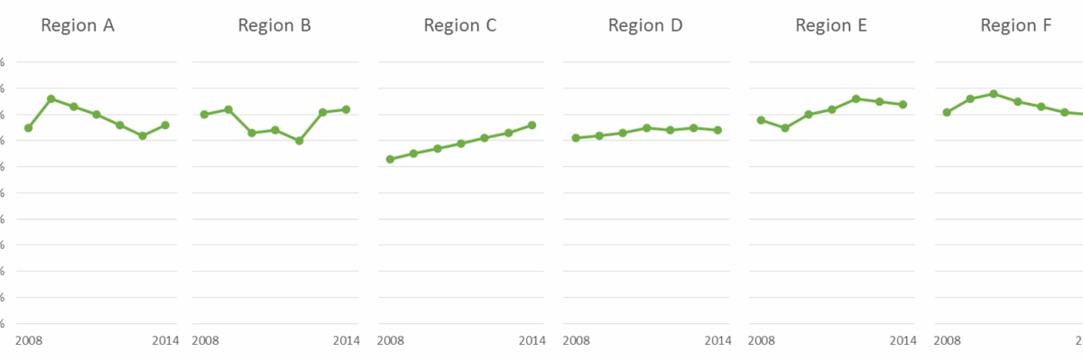
Are you making graphs that look like this crap? I won’t make you raise your hand. But let’s just agree not to do this, yeah? It’s SUPER hard to compare the tops of a bunch of bars. Two side by side bars per region ain’t so bad but beyond…
The Easiest Way to Make Bullet Charts in Excel
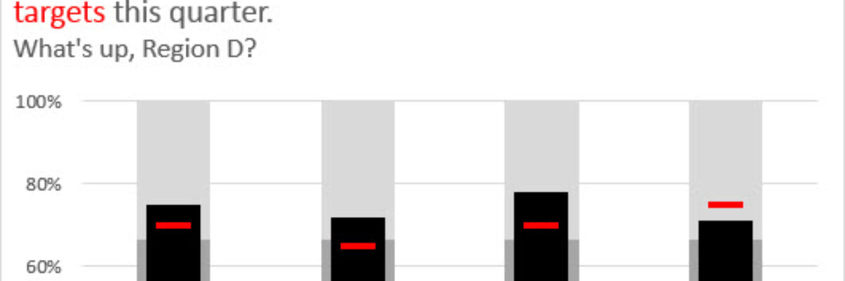
There are lots of ways to make bullet charts, some easier than others, some better suited for specific visualization contexts. Hell, there are plug-ins you can purchase that make it a snap. Except when my plug-in broke and I had to remake about a…
Guest Post – Charting Confidence Intervals
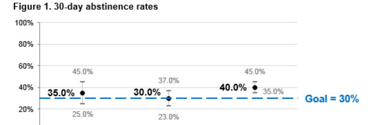
Hi there! I’m Angie Ficek and I’m a program evaluator at a small evaluation consulting firm called Professional Data Analysts, Inc. (PDA) in Minneapolis, MN. In a previous post, Stephanie wrote about adding standard deviations to a dataviz. I responded to her post with an example of…
What the Hell is Wrong with the Projector & How to Fix It
Meet a hero. This is Kailen Brooks. A few months ago, I was giving a workshop on data visualization to about 40 people at the AEA Summer Institute when pretty much everything that could have gone wrong almost did. Someone’s spilled drink ran dangerously close to my computer.
Adding a Benchmark Line to a Graph
This simple line packs so much power. Adding a benchmark line to a graph gives loads of context for the viewer. Here’s how to make one right inside Excel. It’s so easy you might pass out. My data table looks like this: I have my data and I have the benchmark…
Embracing Data Visualization in Evaluation: A Management Perspective
Friends! I’m so happy to have Rakesh Mohan guest blogging for me. He is one helluva guy. He is the Director of the Office of Performance Evaluations, an independent agency of the Idaho State Legislature. In other words, his eval clients are lawmakers. You ask me for examples of reporting in…
An Incomplete List of Females in Data Visualization
I rewrote this post 4 times, in an effort to give it a calm and professional tone. And then I thought “Ah fuck it, this is my blog and I can say whatever I want.” I’m writing this post because I just listened to an interview about data visualization. It…
How to Make Horizontal Dumbbell Dot Plots in Excel
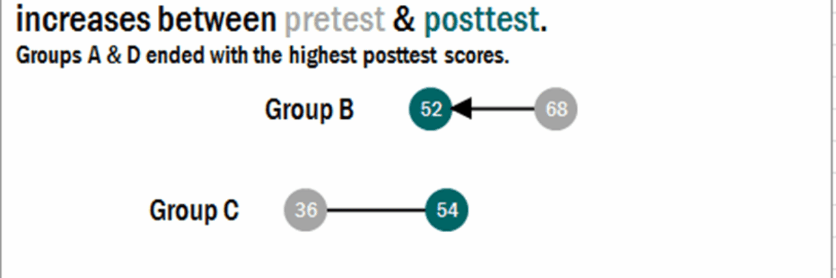
In case it wasn’t clear, I freakin love dot plots. They are amazingly easy to read, beautifully simple in their display. I was making these babies for some clients a little while ago, before and after dots for about 25 variables in one graph.
Choosing a Color Picking Tool
Giant Wes Anderson fan writing you here. So I loved loved loved it when I saw this Wes Anderson Color Palette blog. It’s like several of my happy worlds colliding into rainbows and unicorns. The blogger pulls color palettes from scenes in various Wes Anderson movies. This screenshot is…


