
Guest Post – Charting Confidence Intervals
Hi there! I’m Angie Ficek and I’m a program evaluator at a small evaluation consulting firm called Professional Data Analysts, Inc. (PDA) in Minneapolis, MN. In a previous post, Stephanie wrote about adding standard deviations to a dataviz. I responded to her post with an example of how we add confidence intervals to our charts. I showed her an example of a chart from our past, before knowing anything about data viz, and our present, now that we’ve been “Evergreened.” She encouraged me to write a guest post about this, so here it goes.
PDA evaluates several states’ tobacco cessation programs. The key outcome indicator for these cessation programs is the proportion of participants who quit using tobacco, which is called their quit rate. When we report the quit rate, we include a confidence interval to account for sampling variability since we estimate the quit rate from a sample of the program participants. This shows our client the range in which their “true” quit rate likely falls. Since a quit rate is a “high stakes” outcome in tobacco control, it’s important to include the confidence interval since for any given independent sample the quit rate could vary. So…. Our quit rate charts used to look like this:
The past  Yeah, not so clear what the most important data points are. I guess we were really into bolded fonts at some point in time. Either that or we really thought everything was important. In this example, the quit rate for Program A is 35%, which is our main data point for this program. Program A’s confidence interval ranges from 25% to 45%, but this really isn’t the point of emphasis. I didn’t like that this chart placed equal emphasis on the quit rate and confidence interval values. I saw a few other areas for improvement, so I applied tricks I’ve learned from Stephanie over the past few years.
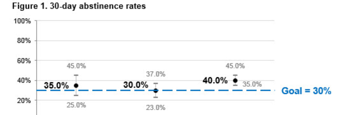
Now our quit rate charts look more like this:
The present  Well hey there, sexy chart! I bet it has a great personality to boot. This chart is much easier to scan and comprehend because of some important changes I made:
- Chart size. The original chart was sized to fit the width of a standard page in Word. Not so important. Plus, I think when combined with dark gridlines, it starts to look a bit like a musical score. Since I wasn’t interested in hearing what that tune sounded like, I made the chart a bit skinnier. I generally follow a 2:1 ratio in terms of the chart’s width and height, a tip I read about in Stephen Few’s book, Show Me the Numbers.
- Data values. The actual quit rate values are the main thing I want to emphasize for our clients, so I made the quit rate values stand out more than the confidence interval values by making the font a little bigger and deemphasizing the confidence interval values with a smaller, gray font.
- Data markers. Similarly with the data point markers, I made the black circle for the quit rates larger, and I deemphasized the markers for the confidence interval values by making them gray instead of shrieking red. Sometimes I wonder if the confidence interval marker is even needed at all though.
- Gridlines. I don’t usually use gridlines, but I like them in these confidence interval charts. The charts feel a little naked without them, even though I also include all of the data values. Maybe it helps me visualize any overlapping confidence intervals. I’m sure that’s the first thing my client is looking for too! Anyway, I lightened the gridlines since they’re not THAT important.
- Axis labels. The axis labels aren’t as important as the quit rate labels, so I first unbolded them, then made the y-axis labels smaller.
- Interpretation. Finally I thought, hey, a little interpretation might be helpful, yes? Great news for quit rates – a goal exists! I added in a dashed line to indicate what the goal is, and used our brand’s main color as my color of choice. I think there’s still room for improvement in terms of how much interpretation we include in our charts and titles, but we’ll get there.
I recently met with some other staff to take this chart through the Data Visualization Checklist. Data viz geeks unite! It was a very informative exercise, and overall the chart did quite well! The biggest area for improvement, as I mentioned above, is related to including more description or interpretation in our titles and subtitles. Something to ponder for future iterations.
Great post, Angie! Have you run your graph through the Data Visualization Checklist? If so, I’d love to see what it looked like before and after you revised it. Send it to me!
