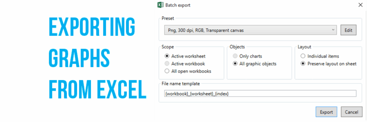
I love when readers send me questions that I can turn into blog posts. The question: We often make our graphs in Excel and pop them in to reports or slides, but the transfer usually causes the formatting to get all wonky. How can we get print-quality graphics out of…
Blog
Timelines, 4 Ways
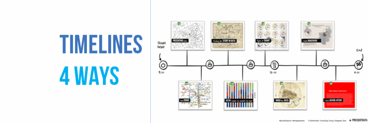
The least helpful timelines I’ve ever seen are these: where time is basically bulleted, as if each of these intervals is equidistant and as if a bunch of text is the best way to communicate something inherently not based in narrative. You are basically saying, this journey is…
What I Do: Before and After Business Slides
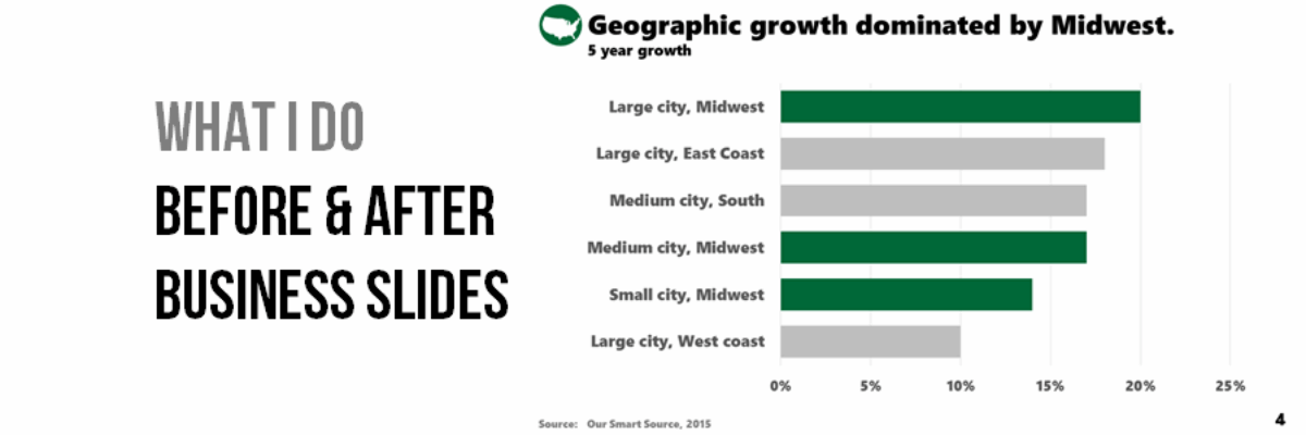
I help people design the best visual supports for streamlined conversations and decision-making. That’s just what New Client needed. He called to say “I need to look great at this meeting.” And by the time he got to that meeting, he looked great *and* he presented his qualitative and quantitative data…
My New Favorite Graph Type: Overlapping Bars
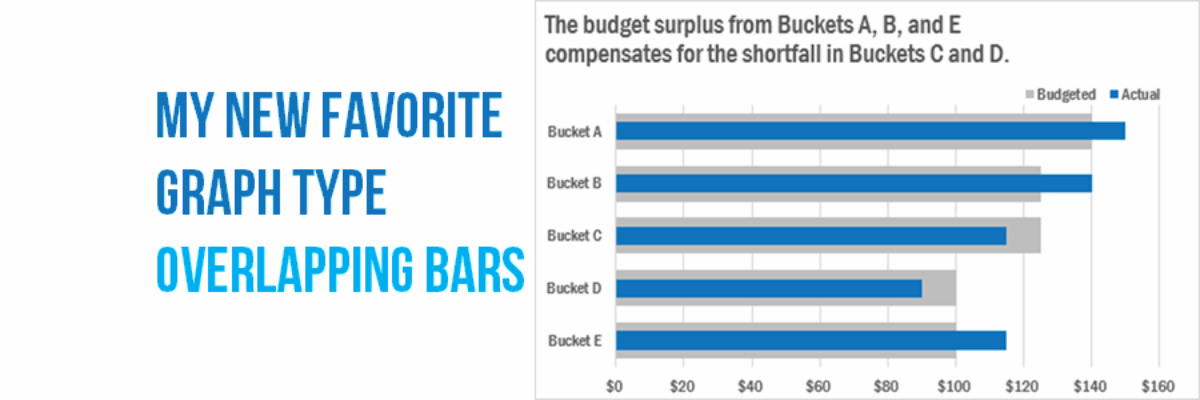
Why have I fallen in love with this graph type? I think its because its such a great way to visualize the comparison between two things, when one is inherently a part of the other. In recent client projects, I’ve used these to show actual v. budgeted amounts. Or individual…
Marketing Yourself as a Public Speaker
After years of making my way as a public speaker, 40 podcast episodes interviewing other public speakers, and a groundswell of people asking me how to grow their public speaking business, how about we chat for a few about what marketing strategies work and what don’t? What Works Before you…
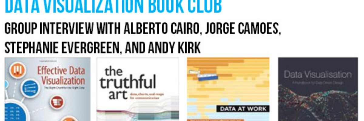
Book Club with Alberto, Andy, and Jorge
So far this year we’ve seen a ton of great books on data visualization published! What an awesome time! I got together with Alberto Cairo, Jorge Camoes, and Andy Kirk to talk about our books and the writing process in general. Not sure which of the latest…
How Middle School Math Pays Off
Dear Mrs. George’s students, Awhile ago I met your teacher at a wedding reception. Her bestie married my father. As one does when engaging in small talk, she asked me what I do for a living. Me: I teach people how to present data. Ever seen a really terrible PowerPoint?…
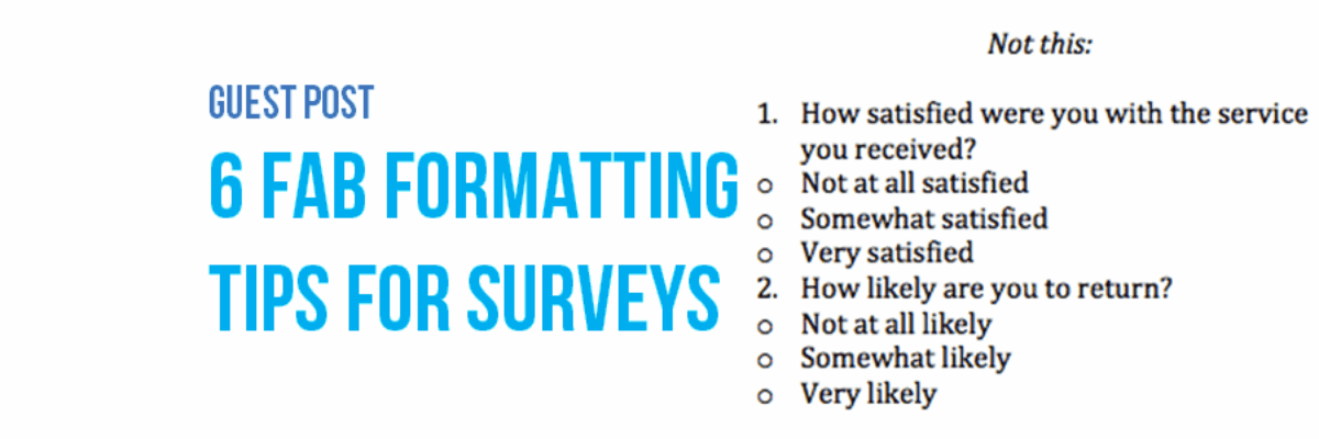
Guest Post: 6 Fab Formatting Tips for Surveys
Note from Stephanie: I asked Sheila to write this post because I still get tons of questions from readers about how to take the design I recommend for data visualization and apply it to survey design. I’m not a survey expert, but Sheila is! Hi! I’m Sheila B. Robinson, a…
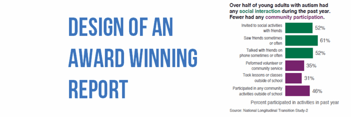
Design of an Award Winning Report
So long as we are going to write reports, we might as well make them heavy on the visuals and do everything in our power to make the report easy to navigate, especially in a mobile reading culture. There are lots of ways to do this but one of my…
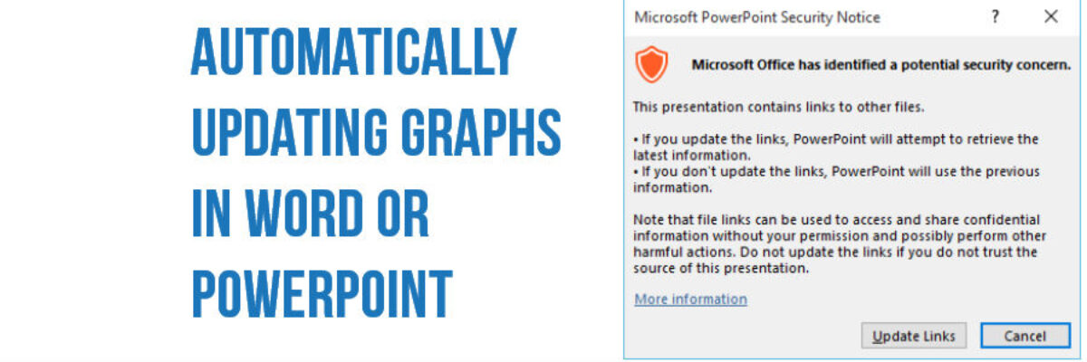
Automatically Updating Graphs in Word or PowerPoint
I have so much money in the bank I’m going to give away my number one reporting time saving secret (HAHAHAHAH not at all! I’m giving it away because I love you and I want to make your life easier). This is how you link Excel to your other reporting…
