How many decimal places do you really need? The level of precision in your data visualization depends entirely on your audience.
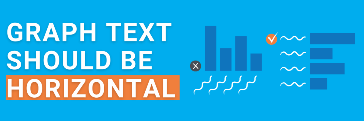
Graph Text Should Be Horizontal
If your text wraps onto multiple lines, is diagonal, or cut off, your graph type needs to change so your text reads horizontal.
Intentionally Order Your Data
Intentional order means you’ve sorted the data so it’ll make sense to your audience. Promise, it’ll never be the order of questions on the survey.
The Fourth Purpose of a Dashboard
We try to please too many audience needs in the same screenshot and then no one is happy and the dashboard dies a slow, expensive death.
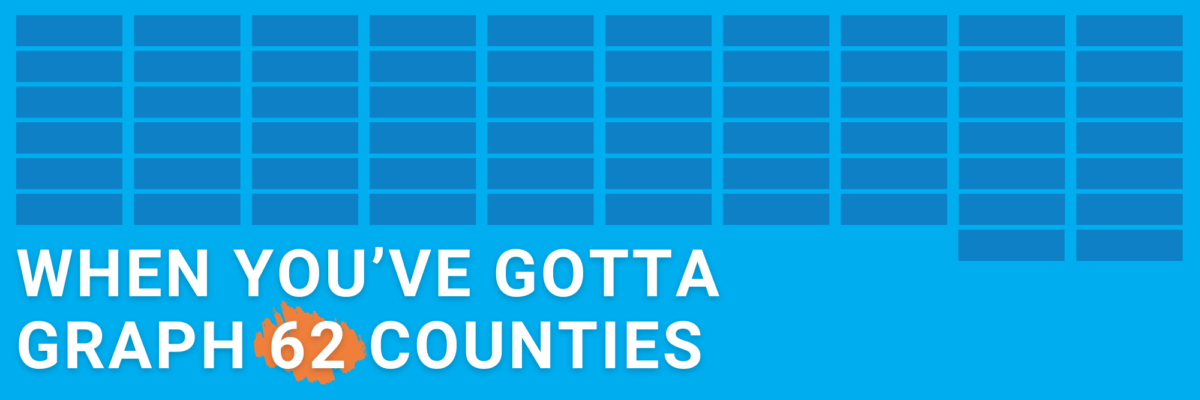
When You’ve Gotta Graph 62 Counties
or countries or students or departments or… you just have a lot of categories to squeeze into your chart. How to proceed without creating a hot mess?
Show Your Symbols
People interpret symbols as pictures, not words. That makes symbols, like $, more instantly recognized and understood than words, like dollar.
Can AI Write Great Chart Titles?
I gave two AI tools – ChatGPT and Gemini – two simple datasets and asked them to generate insightful titles.
Graphing Qualitative Data
Announcing my new chart chooser with 22 qualitative data visualization options.
How Much Data Viz is Too Much
How much is “too much?” I’m sure you’ve seen that eye glaze from time to time. The answer is actually deceptively simple.
Ways to Visualize Statistical Significance
If you’ve passed the two criteria for communicating statistical significance, here are four ideas for ways to indicate it in your data visualizations.

