
Ways to Visualize Statistical Significance

Before we get ahead of ourselves, first question: Should you be visualizing statistical significance?
The answer is yes if you can meet one of two conditions:
1. Your audience is proficient in stats and totally, fully, completely understands what statistical significance means and the implications it has for using the data. Be sure. Plenty of studies show that even academics well-versed in statistics often misinterpret statistical significance.
2. You can explain what statistical significance means, practically, without jargon, to your audience in a way that will be meaningful to them. Blank stares don’t count. This is hard! Even this article, with its solid attempt, is gonna fall flat with many audiences.
(This doesn’t address whether statistical tests are even appropriate for your study. I’m only talking about visualizing here, not data analysis choices. That’s on you. Don’t @ me.)
If you’ve passed the criteria for communicating statistical significance, here are four ideas for ways to indicate it in your data visualizations.
Use an Extra Mark
But my god please don’t make it the asterisk. An asterisk is so passive-aggressive. It’s like “LOOK AT ME! BUT NOT RIGHT HERE. FIND ME AGAIN. i’m hiding in the corner in itty bitty font. just a tiny footnote.”
Let’s upgrade to the current year and try an icon.

And a quick hello to journal editors: Be brave. We have so many more options these days than shift + 8.
Separate Sig from Non Sig Data
Use space or a line to demarcate the significant data from the non-significant data.

Dividing the data into two different groups makes their categorization hard to miss. There’s no mixing this up.
Use Color
Even when the data labels on two bars are different, it can be hard to know whether that difference is statistically significant, right? Change the color of the parts of the data that are statistically significant to make those jump out at your audience.
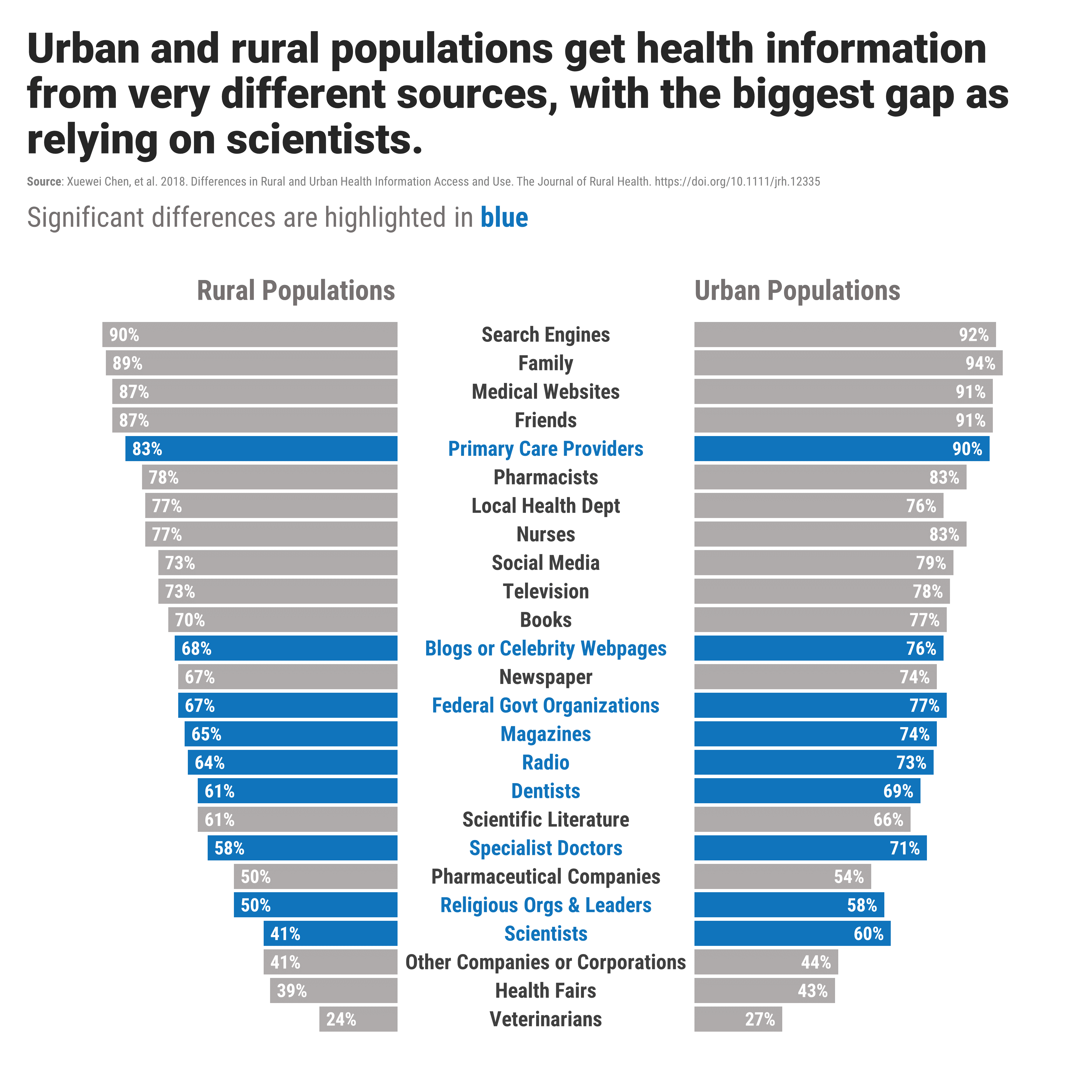
If you’re concerned about how a color change would look in black and white (say, for printing in a journal article) work within the shades of one color. That’ll still hold up.
Of course, you’ll need to tell your audience what the color change means. Pop that explanation into your title or subtitle. Speaking of….
Work that Title or Subtitle
Why be anything less than direct? Use that title or subtitle space to tell your audience exactly what’s what. In a language they can understand.

If it’s too difficult to explain what statistical significance means in words your audience will get, that’s a sign that either you don’t know what it means (ope!) or you’re audience doesn’t/won’t/won’t care – in which case skip it.
