
Graph Text Should Be Horizontal
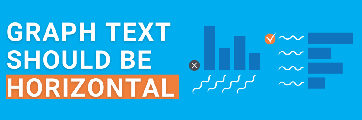
You already know this fact, but somehow we forget it when we’re designing graphs: In languages based on the Latin alphabet, we read horizontally, from left to right.
Reading on a diagonal produces cramped necks.
Reading vertical text is just not gonna happen.
So, as much as possible, the text in our graphs should be horizontal.
Let’s walk through a demo. I was trying to combat my sense of hopelessness about the world by exploring the latest dataviz from Our World in Data related to the Sustainable Development Goals (don’t we all?).
The vast majority of their viz is pretty awesome, especially given how complicated the data can be. I saw this graph about how few developing countries have representation on international development councils.

No doubt this dataset contains many important stories. Your eyes are probably drawn to the big dip for the UN Security Council.
You might also notice a little rollercoastering happening for UN Economic and Social Council.
I venture you also notice that the other lines are pretty flat and clustered up.
We could write stories out of any of those observations. Line graphs are strong at showcasing those particular patterns in the data.
They aren’t as great at letting us easily compare the international organizations in the most recent year. (And some of those folks are my clients, so I’m invested!) If we show just the most recent year of data, we’d also separate the clustering and see each data point easily.
What chart type would that be?
A bar chart.
But let’s clear up on thing first, because when I say “bar chart” my newbie students will often create this:

And this is a column chart. Columns are the ones that go up and down, like a building column. Bars are the ones that go side to side, like you drink off of on the weekend.
The distinction is important because often times with column charts, the text is all over the place.
What’s the point of a vertical, hard-to-read y-axis label if it is pointing out something totally obvious by the chart’s own title? Redundant and hard-to-read! Let’s ditch it.

The text along the x-axis is perhaps worse. The labels are so long that they’re slanting diagonally and some of the labels are cut off, literally making them unreadable.
People try to decrease the font size so that the text shifts back to horizontal.

I had to go all the way down to font size 5 in order to get horizontal labels for every column in this chart. Uh, no. Most readers will quit even trying to engage with the graph if the text is this small.
As I point out in the Data Visualization Checklist, the smallest font size you can reasonably get away with in arm’s length distance reading is size 9.
Even still, some of the labels are still so long they are wrapping onto multiple lines.
If your text is wrapping onto multiple lines, going diagonal, or getting cut off, consider it a big hint that your graph type needs to swap from a column to a bar.

The category labels will automatically become horizontal at a text size that people can see.
It’s an improvement but I’m still missing part of one label (you can tell by the three trailing dots). This is why I love incorporating condensed fonts into my graphs. Condensed fonts are tall and skinny, helping us fit more words into the same amount of space. In my final graph below, I used Roboto Condensed.
I also had to make the graph just a little larger. This data includes a lot of categories with wordy category labels, so the whole graph needs to increase in size to accommodate. Rather than the default 3″ x 5″ graph size, the new graph is 4.2″ x 6.1″.
The numerical axis was overkilling it with all those decimals so I deleted it. I also wanted to add the precise values because almost half of my categories had values between zero and the first gridline, so gridlines alone would make estimation difficult.
I thickened the bars, changed the default color, deleted the chart border, and added a clearer title.

Finally, a readable graph!
Focus on keeping the text horizontal and several other checkpoints from the Data Visualization Checklist will fall into place like magic.
