Man, do researchers love Likert-type data! You know what I mean – the kind of survey response options that range from Strongly Agree to Strongly Disagree (or vice versa, depending on your allegiances).
Probably the most common way of visualizing that data is via a stacked bar chart, just like the one below created by the team at The Hole in the Wall Gang Camp. (Long sidenote: Dudes, have you ever heard of this place? Its a camp, started by Paul Newman [swoon], for children with severe illnesses like cancer, hemophilia, sickle cell, and other terrible things that should never happen to children. Just reading their latest data report made me cry. Then thinking about their data report later made me cry again. Just a little something in my eye right now, must be an eyelash.)
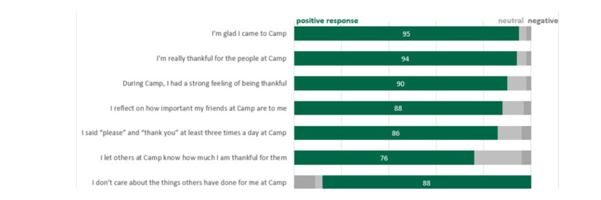
Their basic stacked bar chart reports on Camper Appreciation and the team already wisely ordered the bars from greatest to least on Strongly Agree and made the title into a takeaway sentence. However, you can probably see a few things that aren’t really working. The labels in the skinny parts are scrunched. The x-axis is labeled in 5% increments, which is overkill. And just overall, it feels like a lot to mentally process. What do we do?
My strategy was to first find out what they really wanted to say about their data.
Ann Gillard, Director of Research and Evaluation, said, “We were fortunate to see such strong positive outcomes and want to celebrate this as we share the story of Hole in the Wall with potential campers, families, funders, and friends.”
Lucky for us, they neatly encapsulated it in their title. Notice how they are grouping “agreed and strongly agreed”? They are doing a bit of digestion for their readers by collapsing those categories into a number that’s more meaningful.
And Ann knew it. She said, “We have found that our readers like to see percentages of people rather than numbers of responses, and that readers want to know what people agree with rather than reading about averages. So, we moved away from reporting means in these charts and put the means into an appendix for the other data nerds to view.” Ann is on the right track, plus she called them data nerds so now she is my BFF.
I followed their lead and aggregated those categories by summing their values in the Excel spreadsheet. This equals the Aggregated Stacked Bar: You’ll also noticed I reversed their categories. Since they are emphasizing the positive responses in their messaging, I put those bar segments on the left, so they share a common baseline that’s easier for the audience to read. I only put number labels on those positive responses. I also used their Hole in the Wall Gang Green there and grayed out the rest to add further emphasis where they want it. I reduced the number of increments on the x-axis and color-coded the title a little more.
With those tweaks, the amazing things happening at Hole in the Wall Gang are even clearer to their readers (i.e., future campers, donors, etc). Once more, from Ann, “We are ‘overwhelmingly thankful’ for Stephanie Evergreen for sharing her expertise, warmth, and great ideas so that we can better communicate with our community!”
Aggregated stacked bars are a really good visualization choice when the level of detail in a Likert-type scale is unnecessary. Give it a try!

You can find a lot more step-by-step instruction on how to make awesome visuals in my Evergreen Data Visualization Academy. Video tutorials, worksheets, templates, fun, and community. Excel, Tableau, and R. Come join us.
