
508 Compliance Tools
If you aren’t worried about being 508 compliant, you should be. A part of the Americans with Disabilities act, being 508 compliant means that the stuff you post on your website should be accessible to anyone with a disability. Back when this was first announced, in 1998, it only applied to federal agencies. But in 2016, the Winn Dixie grocery store chain was sued because its website wasn’t accessible to a person with blindness. Indeed, one of our clients this year came to us because they were being sued for not meeting the 508 guidelines.
Trouble is, the guidance provided by the federal government doesn’t include tools to help you determine whether you are meeting the guidelines. So I’ll tell you how we have helped our clients.
First of all, the feds – thankfully – updated 508 guidance in 2017 and their website is much easier to navigate than it used to be. You should start there.
Second of all, I already laid out how to format your work in this post. Read it for the “how to” details. (In addition to that, I saw a related post by Amy Cesal you should read for more rules). So what to fix and how to fix it are already out there.
In this post, I wanted to give you tools for actually testing that your work is 508 compliant.
Color
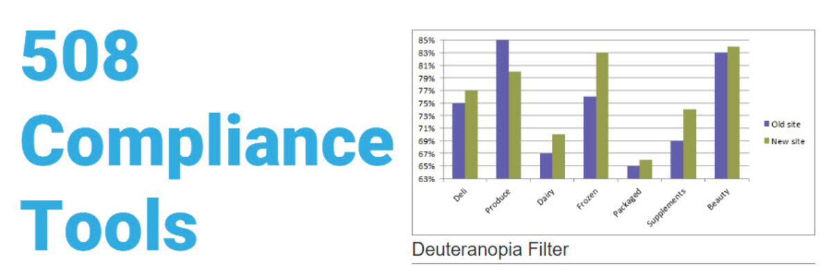
Here, we are mainly concerned about designing for visibility to those who are colorblind.
The two general color rules are: (1) don’t use red to mean bad and green to mean good, because those just look like browns to someone with colorblindness and (2) make sure the colors contrast sufficiently.
Our data visualization checklist will now apply a colorblind filter so you can see how your graphs will look to people with the main forms of colorblindness:

Test color contrast with the Web Aim Contrast Checker. We test branding color palettes to make sure they meet WCAG 2.0 level AA standards. Web Aim, suggested by federal 508 departments, states “WCAG 2.0 level AA requires a contrast ratio of 4.5:1 for normal text and 3:1 for large text. Level AAA requires a contrast ratio of 7:1 for normal text and 4.5:1 for large text. Large text is defined as 14 point (typically 18.66px) and bold or larger, or 18 point (typically 24px) or larger.” 508 design websites commonly state that level AAA is difficult to meet while still using any sort of branded color palette. So plug your colors into this site to see if they sufficiently contrast. If they don’t, you can adjust the colors right in the site until they meet the standards.
Text and Navigation
Generally speaking, if you use the built-in styles of whatever software you work in to identify parts of your text (like, Heading 1, not just making the normal text large and bold) you should be ok. Use what your mama gave you.
Test this, though because you’d be surprised by how often things don’t flow in the order we want. To test out document navigation and screen reading, we use both Adobe Acrobat’s accessibility check and a common third-party screen-reader software, NDVA. (There are a lot of screen-reader software out there but I like this one because the reader has an Australian accent. Check your mobile accessibility too. Most phones have tools built in. Here are the ones for my Pixel, for example.)
To run an accessibility check in Adobe Acrobat, look in the Tools menu, under Action Wizard. Select Create Accessible PDF. The last stage will run the accessibility check. To activate the screen reader in Adobe Acrobat, go to the View menu and select Read Out Loud, then Activate Read Out Loud.
You’ll also want to check reading level. 508 guidelines recommend aiming for a lower secondary education reading level. Check websites by pasting in the URL here. Check static documents in Microsoft Office by looking in the Review tab and clicking the Check Document or Spelling button (depending on your version). Once your document passes all spelling and grammar tests, you’ll get a report with the reading level.
Note that I’m not addressing how to make visuals compliant here because I’ve done it elsewhere and it really means making sure you have associated text and you’d use these tools to check that.
You will want to have checked out all of this stuff long before hitting Publish. But as a final check after you’ve gone live, run your site through Wave, which will show you places on your site where you didn’t make the cut. Looks like I need to head back to my homepage and make a few adjustments:

The list on left is showing me some red, yellow, and green places (ironically, not colorblind friendly) where I need to correct some errors.
The thing that can make 508 compliance scary is not having the right tools to tell you whether or not you are compliant. So, here you go. Let’s get five oh eight friendly.
PS. If you want to see how that bad column graph fared on our dataviz checklist, you can access the full score here.
