Few things are more tragic than excellent non-profits doing great work to help struggling families but can’t tell their story effectively. In this blog post, I’m going to step you through the redesign of a one page handout I created for my clients at the Education Development Center.
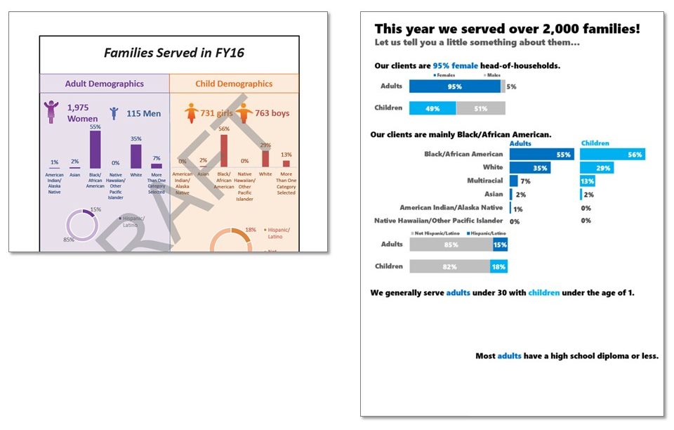
Their Michigan team was trying to talk about the clients they serve, using a page layout that looks like it came right out of the bowels of Microsoft Word.

I started by focusing in on the title. This currently isn’t telling me much.  Are we talking about the impacts of service on these families? Are we talking about their demographics? Also, let’s swap out the unfriendly “FY16” for something that is more plain language. The new title is already giving out important details and explaining that the rest of the page will be demographic descriptions of the families.

Also note how I’ve already swapped out boring default Calibri for a stronger font (Segoe UI Black). I took out the italics, which actually typically make text look lighter and deemphasized, and left justified everything since that’s where we start reading in Western cultures.
Next I tackled the gender section. It took me a moment, but once I started really comparing their numbers, I realized that while gender is pretty evenly distributed among children, EDC is serving far far more women than men. That’s a huge story that’s lost in the current format (and the icons definitely aren’t cutting it).

In the new version, I used the precious title space to tell that story directly.

Their next section covered race and ethnicity, though there was no title to say as much.

So I added a title that spoke to the fact that most of the adults and children they serve are Black/African American.

The bottom of the handout showed age ranges, this time with a title “Age” for adults but no title for children.

The new title is more descriptive about the ages of their clients (and you can see I’m planning to do some color coding in my graphs, rather than color coding by page background).

Finally, in the middle of the handout, they were squeezing in data about education, throwing off the layout of both the ethnicity and age graphs. So I reordered the sections and added a new, descriptive title.

At this point, the titles of each section are going a long way in telling clear stories about the families served. They also act as section placeholders, marking off the handout into distinct areas that will hold the graphs. So let’s revisit those graphs!
Icons and large numbers can sometimes work in data visualizations. But now that we know, from the title/our interpretation of the data, that there’s a big gender disparity among children and adults, we need a better way to visualize that comparison.

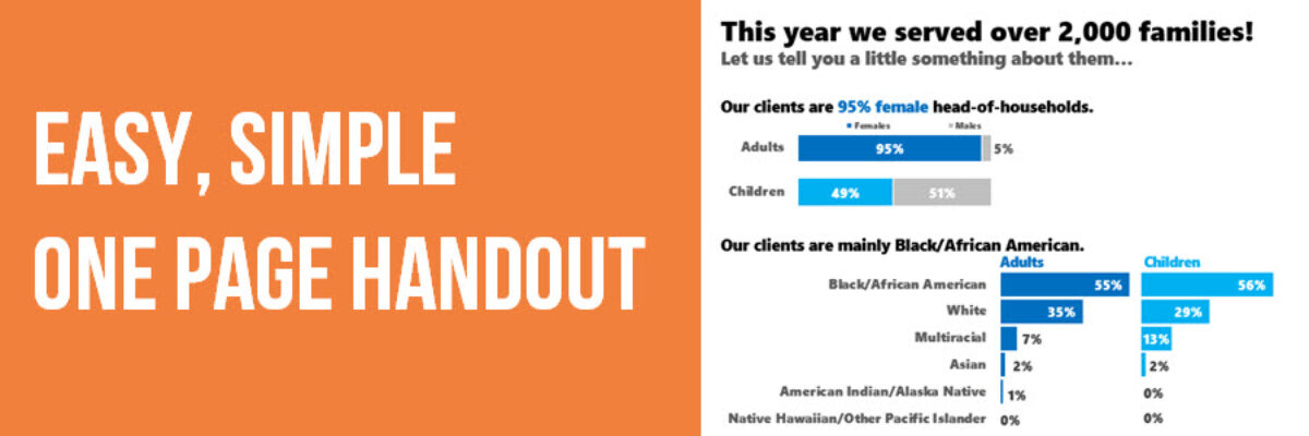
Stacked bars will work well here. They show part to whole pretty well, especially when there are only 2 categories. And they fit into a small space, which comes in handy because I’m going to massage a lot of data into one page. Notice I started color coding adults as darker blue and children as a brighter blue.

Next I tackled the race bar charts. In the original, the bars were 2 different sizes, both in terms of their y-axis scale and the bar width – these are the things of kinds that will make a reader wonder what’s going on. Does the varying width mean something or is this just a lack of attention to detail (and if we lack attention to detail here, where else is it occurring in this organization)?
In the new bar charts, I ordered the race categories greatest to least, carried over my color coding, and made the bars much thicker, for a stronger visual impact. They are the same width and on the same scale. I also swapped columns for bars so that my race category labels could stay horizontal and on one line instead of wrapping onto 5 lines like the original.

For the ethnicity graphs, I switched out the thin doughnut charts for another set of stacked bars, which again take up MUCH less space on the handout and better let us compare children to adults.

Since age is age, no matter whether it is ages of adults and children, I put the two age datasets in the same graph type. It didn’t make sense to me to have one that was a bar chart and another that was a pie. Check out how I used my color coding to highlight certain sections of the age graphs that pointed out the primary clientele.

And because these age data are so closely related, I put them on the same scale.

Lastly, I added a stacked bar to the education data that previously had no graph at all. I kept their spirit of icons but relied on the new built-in options from PowerPoint. Again, color coding helps make it clear that this data is referring to adults.

AND I got rid of the page border, which was eating up some of my space.
Things I didn’t do: Leave room for their contact information and logo, though we certainly could. I definitely didn’t worry about the fact that this is just a bunch of bars and people might find it boring. I also didn’t communicate the fiscal year.
Creating the new version probably took just as much time as the original. This isn’t an issue of time. Or fonts (I used defaults). Or software (I used PowerPoint). It’s a matter of some education around presenting data effectively. That’s what I do in my workshops and my books. My clients have already incorporated this redesign into their reporting for this page and others and now they are leading with the story in their data.

