
You Gotta Have An Equidistant Axis
Here’s the thing: The scale used on each axis must have equal intervals. It’s an easy mistake to make.

Your graphing software automatically spaces your intervals and labels equidistant from one another.
It’s assuming that your intervals actually are equidistant.
In this graph, that’s not the case.
We’re missing the months of March, April, July, and August, when either no one was enrolled in the study or we have some missing data. But we can’t just gloss over those months. It isn’t truthful and it distorts the data display.

To make the graph display correctly, you have to adjust your table in your spreadsheet so that you have space in the table for those missing months, even if there’s no data there.
Excel will add the months to the axis.
You then have a choice about how to handle the gap months.
Should you just skip over them and connect the points in the line? Should you report them as zeros? Your call, but make that decision in the Select Data window.
Right-click on your graph and click Select Data. In that window, look for the button in the lower left that says Hidden and Empty Cells and click it. In that new window, you’ll get options for how to handle the missing data.

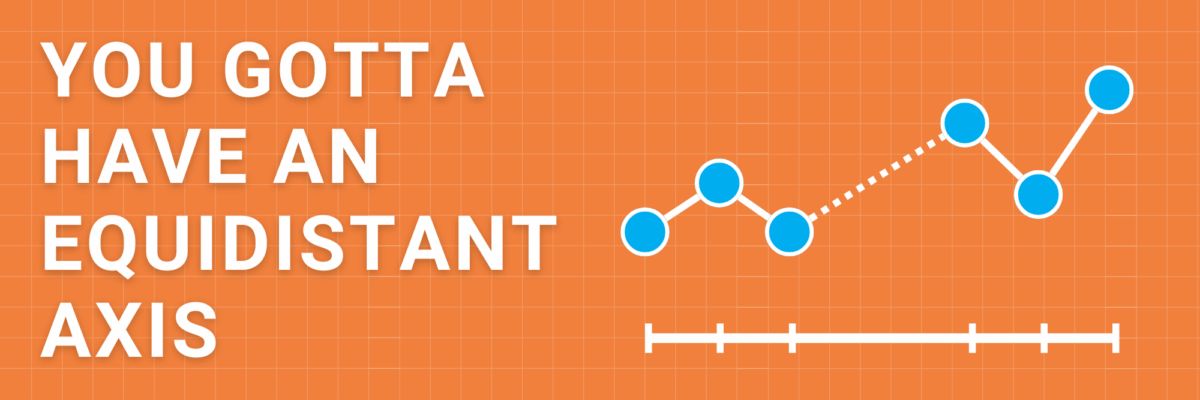
When I collected data at irregular intervals, it’s one of the only times I think it’s appropriate to use place markers along the line. Usually markers are a little too much extra noise. But in this case, they serve a clear purpose to identify where data is actually reported, while still maintaining an equidistant axis.
Equidistant on the value axis too, please.
Honestly, I’m not even totally sure how this could be possible in any graphing software, but here we go.
Somehow, the scale on this chart has increments that are sometimes 10, sometimes 30, and sometimes 50.

When the scale shrinks and grows randomly (while appears to be equidistant), it means the slope of the line is totally inaccurate. This graph can’t be trusted.
In some places, the line is flatter than it should be and in others, more sharp. The increases and decreases aren’t comparable to the other increases and decreases in the same chart.
Don’t do this.
This advice is a checkpoint on the Data Visualization Checklist, where you can run a pic of your graph-in-progress to get feedback on places to improve.
