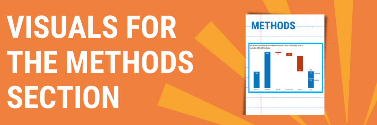
Visuals for the Methods Section
You can tell when someone is getting their data viz eye well-honed because they start asking where ELSE can I include visuals that will better explain my work? That’s Sue. She had grown comfortable with high-impact, story-telling charts in the Results section of her reporting but was staring down a solid wall of text when it came to her Methods section. She pitched the question to me in an Academy Office Hours session: What can I do with the Methods section?
In Sue’s case, her methodology included a phone survey and she had a thick paragraph describing who they included in their sample, who was removed from the sample, and how many people they ultimately included. This is a grand opportunity to include a waterfall chart. Waterfalls show the increases and decreases, usually over time.
You might also be able to tell a story about sample size with nested boxes.
If your methods section includes a demographic description of your sample, try adding even simple bar charts to that section of your report.
And if your demographic description includes a comparison between your sample and the general population, pop a proportion plot in there.
To be honest, my preference is that we move that Methodology section to the end, after you discuss your Results (which is what people are most interested in reading). No matter where you choose to trot out your methods, that content is sure to get more attention when you add some data visualization.
In the Academy, we have tutorials on how to make each of these charts in Excel, Tableau, and R. Heck, in the tutorial on Demographics, we share a dozen different ideas for ways to make that data more graphic. That tutorial, just like this blog post, came about because an Academy student asked me a great question, “How do I…?” In addition to tutorials on just about any chart type you can think of, we are also on stand by to dream with you and, together, build some awesome solutions.


