
Interactive Heat Maps
One of the most common ways to analyze qualitative data is through thematic coding. Thematic coding allows us to move beyond the visualization of word or phrase frequency, like in a word cloud, and start to examine attributes and stories that emerge from the data.
The New York Times has some of the best interactive qualitative visuals out there. Check out this example. Its clickable and lets you take a deeper dive into the candidates you are most interested in. These are awesome and beautiful but the reality is that most of us don’t have the budget or expertise to build something like this.
What if I told you I found a couple solutions? I’m going to show you how to build interactive heat maps in a program I guarantee you have on your computer right now: PowerPoint.
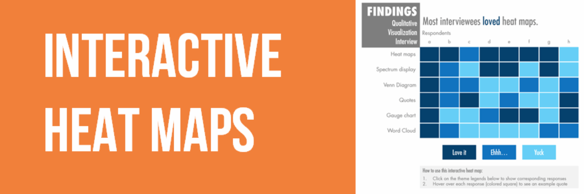
Static heat maps are super easy to make. Usually, you have your themes across the top of the table in columns. Then, you have respondent interviews in each row. You then figure out a way to code each interview per theme. You could do something like: “met/partially met/not met” or “Important/kind of important/not important.” In the example I am going to showcase today, I used “love it/ehhh/yuck.”
Let’s say I did some interviews with researchers asking them about ways they visualize qualitative data. I asked about different chart types and coded their responses on whether they love it, feel ehhh, or if it is yuck.
This static heat map does a good job of taking all that complex qualitative data and simmering it down, but it’s never enough. It boils all my rich, meaningful data into three vague buckets.
I find myself wanting more: why do they dislike it? What makes a certain chart type so great?
Of course, the answers to these questions can usually be found in the text-heavy report that accompanies this visual.
I’m going to show you how to make a heat map interactive, where background quotes behind each color-coded cell pop up. This is where we’re headed:

- Design the structure of your heat map structure, all greyed out.

Don’t feel intimidated by this design. In PowerPoint this is made with textboxes and square shapes. It’s just a bunch of squares all aligned. When making this, the align tool in PowerPoint will be your best friend. If you’re not familiar with that tool, then check this out and your mind will be blown (no more endless nudging).
- Once you have your basic structure down, we need to name our legend objects. To do this, start by clicking on your “Love it” square. Go to the Format tab and under the Arrange section, click on Selection pane. In the window that pops up, the rectangle shape selected will be highlighted saying “Rectangle #”.

Double click on the name “Rectangle 69” and rename it “Theme 1” or “Love it.” You can name this whatever you want, but you just need to remember the name for a later step. Repeat this step for all legend squares.
- You want to make sure all those grey boxes are grouped into one object. Select the entire object (all grey squares), copy, and paste it. Align it exactly on top of the other grey squares, so when looking at it, you cannot tell there are squares piled on top of one another. Ungroup the grey ones on the top. First start with the Love it squares. Color code all of them dark blue. Insert a textbox with an active title at the top. Make the background of the title text box white.

Now, select the title and dark blue “Love it” squares and group them.
- Next, you will do the same thing for the Ehhh theme. You must insert another textbox title overtop of the Love it title you just made. Make sure the background of the Ehhh title text box is white so that it completely covers the Love it title. Group this text box title and the medium blue squares together.

- Do the same thing for the last light blue group. Note, make sure all the textboxes for the titles all have a white background and are the same exact size. They should be layered on top of one another.

- Now, click on the dark blue Love it squares/title group and bring it to the front. Once it is to the front, while selected, go to the Animations tab. Click “Appear” under Animation. Then under the Advanced animation, click on Trigger, “on click of”, and select “Love it/theme1.”
- Then, while this group is still selected, you will select “Add animation” and click on “Disappear.” Then under the advanced animation, click on Trigger, “on click of”, and select “Love it/theme1.” That tells PowerPoint that when the “love it” legend square is clicked, the Love it heat map group will appear, and when it is clicked again it will disappear.
- Repeat steps 6-7 step for Ehhh and Yuck. Make sure you link them to the correct trigger button.
- Test this out! Go into presentation mode and follow the instructions. Click on the theme legend Love it. It should do this:

Each time you click on a legend, it gets added to the heat map. You can unselect it by clicking on the legend button again.
- Now, we need to add the quotes in the background of each square. To do this, we are going to be using the hyperlinks feature in PowerPoint. These steps will need to be repeated for each square inside the heat map:
Right click on just one square. Go to Link- Insert link. This box pops up:

Make sure “place in this document” is selected under link to on the left. Then select the slide where your heat maps lives (probably slide 1). Once that is selected, click on the “ScreenTip…” button in the upper right-hand corner. Type your quote here. (“I love theme maps so much, they help organize all my data and make it easier to comprehend and make meaning.”)
Now, when you are in presentation mode, you hover your mouse over that square and the quote pops up- yay!
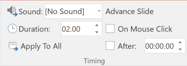
- There are a couple more things I recommend doing to make this document more user-friendly. As you can tell, the only way to make this interactivity work is if you are in presentation mode. When you are in presentation mode, do you see how if you click on the three legend buttons it all works well, but if you accidentally click on one of the heat map squares, it goes to a black “end slideshow” screen. We don’t want that to happen. We want people to be able to play around in here. To make the screen not go black, go to the Transitions tab at the top. Over on the right under timing, do you see where it says Advance Slide and there is a check by “On Mouse Click”. Well, unselect that.
There are a couple of other things that make the usability of this file challenging: 1) people can edit this. When they first open the document, it is in the edit window, not presentation mode. And 2) It is annoying that you have to instruct people to put it in presentation mode. Some people (non-techy folks) might get confused. We can avoid these two issues by saving this as a different file type. Only do this step when you are 100% done editing. Go to file and save as. Under the file type dropdown, change it to “PowerPoint 97-2003 Show (*.pps)”. This will save it as a presentation-only document. The moment your client opens the file, it will be in that interactive mode and they will be unable to make edits.
Cool, right!? I will give you a moment to get over the wave of awesome that I hope you are feeling right now.
Interactive heat maps give us both a visual synopsis of qualitative themes and allows us to highlight our raw data without bogging down the visual. We get more depth and interactivity. Try this out and let us know how it goes.
Students in my Data Visualization Academy get the step-by-step instructions on how to make this chart using Adobe or Excel or Tableau or R. Come join us!
In the meantime, download my Qualitative Chart Chooser for 21 other ways to visualize qualitative data.
