
Histomaps
The histomap is one of the oldest, and most famous, ways to present qualitative data over time. The first example was created by John B. Sparks in 1931, titled “The Histomap: Four Thousand Years of World History.” At the time it was printed, the chart was marketed as a clear, non-elaborate way to engage lay people with complex world history.
I’m not sure I’d quite describe the massive 5 foot visual in the same way today, but it does do an impressive job of distilling power and history over 4,000 years into a relatively short display. To check out the visual, you can see a nice zoomable image here.

Histomaps can be a good option when we are looking to visualize qualitative trends over time. The trick is that you need to be using two mutually exclusive variables. In Spark’s case he used time and power.
In the example below, I’m using time and staff’s satisfaction with their work environment. Imagine you are collecting open-ended survey data every quarter during your grant term. You code a person’s response into the mutually exclusive category of met, partially met, and not met regarding their expressed satisfaction. At first my Excel document looked like this:

Then, I calculated the percent and used that as my graph’s source data:

You then chart this data using a stacked area graph. Each group (met, partially met, and not met) is plotted as a different series. At first, the graph is horizontal and looked like this:

We need to turn this so that time is along the y-axis. I just copy and pasted the graph as an image and rotated the graphic. I then added text boxes and lines for the y-axis and added x-axis category labels.

This is a great example where added annotations can become useful. What was going on at the end of Q4 in 2016? There was a downward trend in satisfaction until the big jump in Q1 2017. Maybe there was a toxic staff member who was let go? Maybe a grant that funded staff salary was ending in Q4 2016 and staff were feeling insecure and nervous about their job. At the last minute that grant was renewed!
Whatever it was, an annotation can help provide more in-depth context. Since this is graph is backed up by qualitative data, let’s use it to tell the story.

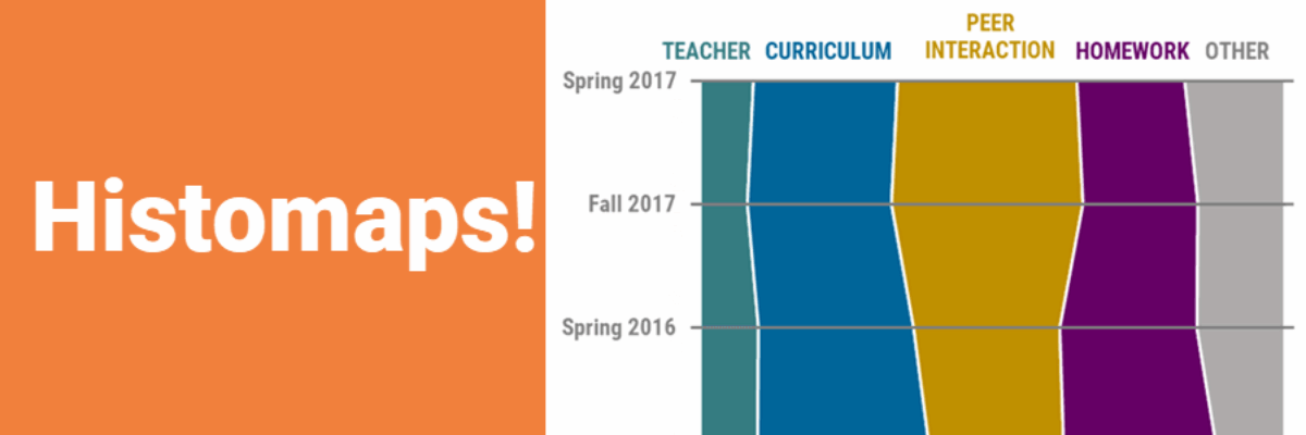
Another way to think about using a histomap is to take a qualitative question and categorize the responses into themed buckets with more detail than met, partially met, not met.
If you asked during a focus group what students would change about a program, you could categorize the responses into themed buckets like: teacher, curriculum, logistics, peer interaction, etc. Then those buckets could be used as your variable tracked over time.

There are so many fun ways to utilize this visual for qualitative data. Take a stab at it and let us know how it goes. Happy visualizing!
Want even more ideas for visualizing qualitative data? Download my Qualitative Chart Chooser.
