
Guest Post: Getting Started with Graphic Recording
By Lydia Hooper, Fountain Visual Communications
Data visualization professionals often focus on numbers, helping to tell the story of what, when, where, and how much. But more often than not organizations first need to better understand the why and how.
Before there is a need to communicate key insights from quantitative data, there is always a need to communicate first about what insights will matter most to the people involved, and therefore what data to plan, collect, analyze, and present.
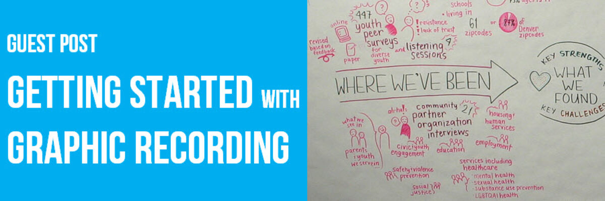
Graphic recording is a method for using visuals to support communication and understanding during real-time dialogue. Hand-drawn illustrations allow teams to simultaneously collect, analyze, and report information about people and groups.

There are several reasons why graphic recording is hands-down a great method for visualizing information:
- It’s an opportunity for thorough reporting. Graphic recording captures both broad themes and the actual language used.
- The method mirrors the content. By portraying social processes, the visual both reflects and highlights the interactions themselves.
- Relationships are kept central – and they are supported. Real-time graphic recording allows partners and stakeholders to better communicate and understand one another in the very moments when decision making is happening.
- It’s exploratory in nature. Discussions are inherently dynamic, not concrete, singular, or fixed. Graphic recording allows for multiple realities to be explored simultaneously, helping everyone better understand the complete, evolving context.
- It allows for remembering and reflecting over time. Groups of course change over time. Participants can revisit the visuals to not only recall what was discussed but to remember their personal experience was. They serve as a fun, ongoing feedback loop for continuous, thoughtful decision making.
When I first started helping organizations with communicating about data and complex topics, I quickly gathered that they needed more help with internal and partner communications to reach meaningful, shared understanding than they did with external and mass communications to persuade anyone else.
Unfortunately, too often these internal communications are overlooked, side-stepped, or rushed through. Social dynamics are complex and navigating them can be overwhelming. As with any good data visualization, graphic recording makes understanding this complexity easier and communicating about it transformational.
For example, during one meeting I graphically recorded, the two groups that had been convened had so little understanding of one another that they spent almost an entire hour debating about whether to proceed with the agenda for the meeting. By the end of the meeting, they could clearly see that the solutions to the questions and concerns that they had initially raised were easily found among one another.

The process of graphic recording can support internal dialogue as well as any communications that follow. Many times a graphic recording I created during a team’s process became a visual that they proudly shared with others as a representation of not only the “who” and “what” but the “why” and “how.”
Perhaps the best news of all is that graphic recording is a tool that doesn’t require extensive planning or even knowing software to begin using it. Like all data visualization, it does require a certain degree of visual clarity and, above all, the willingness to stay true to the data and to consciously engage in a thoughtful process in order to share it in a way that will be meaningful and effective.
Here’s some tips for getting started:
- Practice listening objectively. As always, content is king. To make sure you are capturing the most important ideas and themes, you need to both listen without judgement and allow time for thinking and synthesizing before making marks.
- Learn the basics. Whether you are using markers on paper or a stylus on a tablet, you’ll need to slowly master lettering, using bullets, lines, arrows, and boxes, and drawing people and faces. If you are, like most people, unfamiliar with and/or intimidated by drawing, start with Dave Gray’s visual alphabet below.

- Build your vocabulary of visuals over time. Again, focus on developing this based upon key concepts rather than exciting icons or complex metaphors. For example, when people are describing emotions I often use hearts and when they are talking about ideas or “aha”s I often use lightbulbs.
- Mind the big picture. Draw connections between ideas, use size to emphasize ideas or themes, and consider layout ahead of time (many folks start using graphic recording by using pre-existing, pre-drawn templates).
- Practice, practice, practice. Only real-time practice will flex the muscles you need to write and draw faster, capture content more accurately, and become more helpful to the folks in the room. The easiest way to start may be to capture one-person talks or podcasts in a private notebook (also known as sketchnoting) and then work your way up to capturing discussions publicly.
- Leverage our supportive community. Connect with a local chapter of org, follow graphic recorders on social media, and ask us questions. We love helping others learn more about this incredible, little-known tool!
Lydia Hooper specializes in helping organizations collaborate and communicate about complex topics. She has partnered with more than 50 organizations and networks, offering services and trainings in data storytelling, graphic recording, and communications strategy. You can read more blog articles and get a free copy of her ebook about graphic recording “Using Visuals to Support Collaborative Work” at www.fountainvisualcommunications.com.
