
Friends Don’t Let Friends Use Stoplight Color Schemes

Google image search “data scorecard” and you’re gonna get a lot of this:

Full, just FULL, of stoplight color schemes.
Friends don’t let friends use stoplight color schemes. This is the tiny hill I am willing to die on.
So Friend, let’s talk about why this has gotta stop. There are three solid reasons, each of which, on its own, is more than enough to get the red-yellow-green scheme out of the death grip in most company cultures.
Reason 1 – Stoplight color schemes aren’t colorblind friendly.
The most common form of colorblindness is red-green.
Which means that when we use the stoplight colors to communicate that red means “bad” and green means “good,” people who are red-green colorblind literally can’t tell if you are talking about the worst stuff or the best stuff.
That first scorecard that popped up in my google image search:

looks like this to someone who is red-green colorblind:
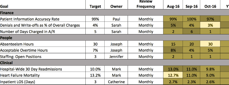
That’s a hot mess, Friends.
Red-green colorblindness affects about 10% of men with European ancestry and about 6% of Japanese men. Not as prevalent in other demographic groups, but certainly something to design around. Because if you miss this, you won’t be compliant with the Americans with Disabilities Act and you’ll be at risk for a lawsuit.
Even Beyonce got sued because her website wasn’t 508 compliant. And you don’t think you are better than Beyonce, DO YOU?
If the threat of a lawsuit isn’t enough to compel everyone to let go of the culture of red-yellow-green, do it just because it’s the right thing to do for people with this impairment. Have a heart. Geez.
I’ve got more strategies to increase your accessibility here.
Reason 2 – They don’t translate in black-and-white.
In this day and age, do we still need to worry about people printing in black-and-white?
We sure do.
Funding proposals are still distributed to committees on paper.
Boards of directors still review printed board books.
In fact, the more top secret the contents, the more likely it is to be distributed on paper.
And black-and-white printing is cheap.
Here’s how that scorecard looks in black-and-white:

Can you tell what’s what? Friends, this is another hot mess.
The upshot is that when we fix this color issue for colorblind folks, it tends to solve the black-and-white problem, too. We feed two birds with the same seed.
Reason 3 – It emphasizes nothing.
When color emphasis is everywhere, nothing stands out.
It just results in a visual that feels noisy and busy.
A better option would be to restrict your color-coding – select only reds or only greens. Anything that isn’t in red, you’ll know is good to go. Or, conversely, anything that isn’t in green needs attention. Pick just one color to get your audience to focus.

In this scaled-back version of a data scorecard, I only used red dots to indicate where the target isn’t being met for the most current month and the year to date.
The tiny trendlines will tell you if we were previously higher or lower than the current month. So much more streamlined, way less noisy, works for the colorblind and in black-and-white.
The stoplight color scheme is so deeply entrenched in some company cultures that it can seem like it’ll be around forever. And it can feel as though suggesting a change is like screaming into a hurricane.
But I’m here by your side as your fight for a more accessible change.
I’m up on this tiny hill and, Friend, there’s room for you to join me.
You can check your own charts using the Data Visualization Checklist. We’ll show you what your graph looks like to someone who is colorblind.
