
Ever Heard of a Dendrogram?
When Jenny Lyons and I were pulling together the revised chapter on Qualitative Visualization in Effective Data Visualization, 2nd edition, we ended up ditching this section on dendrograms. In the list of most-likely-to-use qualitative visuals, this one is probably not in anyone’s top ten. But we still wanted to share this visual with you because, well, the world of qualitative viz could always use more options.
Dendrograms are not THE most common qualitative visual because they require a data generated through a hierarchical cluster analysis. Cluster analysis can be a useful tool in analyzing qualitative data. By clustering groups of participants with similar qualitative codes, you can better understand your findings. According to Henry & team, this analysis can help “reveal things like participant motive and the reasons behind counterintuitive findings.”
Check out Henry’s article to learn more about the analysis. Here, let’s just focus on describing a dendrogram that could display those hierarchical cluster analysis findings. They can be a little confusing at first, especially since the x-axis has 100% closest to the y-axis when we aren’t used to seeing it that way. Walk through this example with us.

In a dendrogram, there are clades which indicate each branch, leaves which are the terminal end of each clade, and outliers. Outliers are clades with only one leaf.
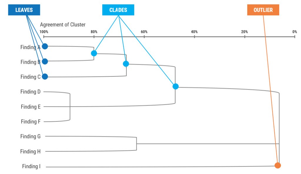
The width of the branch indicates how similar the items/clusters are from each other. The y-axis are all the findings in the data. Then, the x-axis is the percent of agreement between participants. The closer a clade is to 100% on the x-axis, the higher the level of agreement between participants. Usually people decide to cut the tree in order to group clusters together. There are many factors that determine where to cut the tree but let’s say in this example we cut the tree at 80%. This dendrogram highlights that 80% of participants agree with clusters A/B and D/E/F.

One downside to dendrograms is that they can get complicated. They may be best suited for when you have a small number of findings. As usual, use color and effective titles to make your message come to life. In this example, let’s say we are examining participants responses given in interviews about their reasons for attending leadership training on sexual assault prevention. You can see the two clusters that come to life at 80% agreement: 1) a cluster at 92% agreement on community impact and 2) another cluster at 80% on personal benefits.

Software programs that run hierarchical cluster analyses also have the capability to display the data in a dendrogram, but it probably won’t look that appealing. So import the image into PowerPoint. Then, add colored lines, dots, and a title to help make the visual easier to understand for your audience. This will help make a complicated visual like a dendrogram readable and impactful!
PS. I’ve got 21 other ideas for graphing qualitative data in my new Qualitative Chart Chooser.
