
Decolonizing Data Viz
What is Data Visualization?
A visual representation of
quantitative or qualitative data.
so says Stephanie Evergreen.
The strength of this definition is that it is so broad, lots of things fit under its umbrella. But perhaps that is also its weakness because it leaves what counts as data open to interpretation and this is where the problem lies. Often, people with power and privilege are the ones who get to do the interpreting about what’s in and what’s out. What counts and what doesn’t. The history of data visualization (and often history more generally) is written by white men. And history is upheld by them too, even among the data visualization crowd of today, who cull lists of historically important figures and decide whose stories will be remembered, whose work will become “foundational.”
The accounting of viz history is rooted in Europeans and their wars: Minard’s alluvial diagram of Napoleon’s march,

Nightingale’s coxcomb on soldier deaths in the Crimean War,

Scaife’s History of the Civil War in the United States.

The scope of our field’s history, like so much of the way history has been framed, is Eurocentric in view and rooted in conquest.
The three previous examples – and many more along this same theme – are part a gallery of historical visualizations at Stanford, where the artifacts collected (by a white man) reinforce a position that data viz as a field originated during Enlightenment – so European roots, 17th and 18th century. The curator says as much in his introduction to the exhibit (emphasis added):

Here is another one from that collection, a “new chart of history” made by a European white man. It is hard to see, what with it being dwarfed by the size of the Roman Empire, but America is at the top and its roots barely extend past 1300 Common Era.
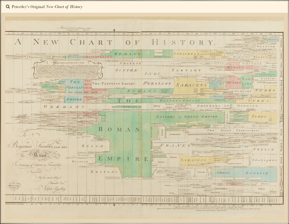
Just as this was Priestley’s way of defining what counts as history, the collection of historical data visualization is a way of writing data viz history that omits many people, specifically people in indigenous nations.
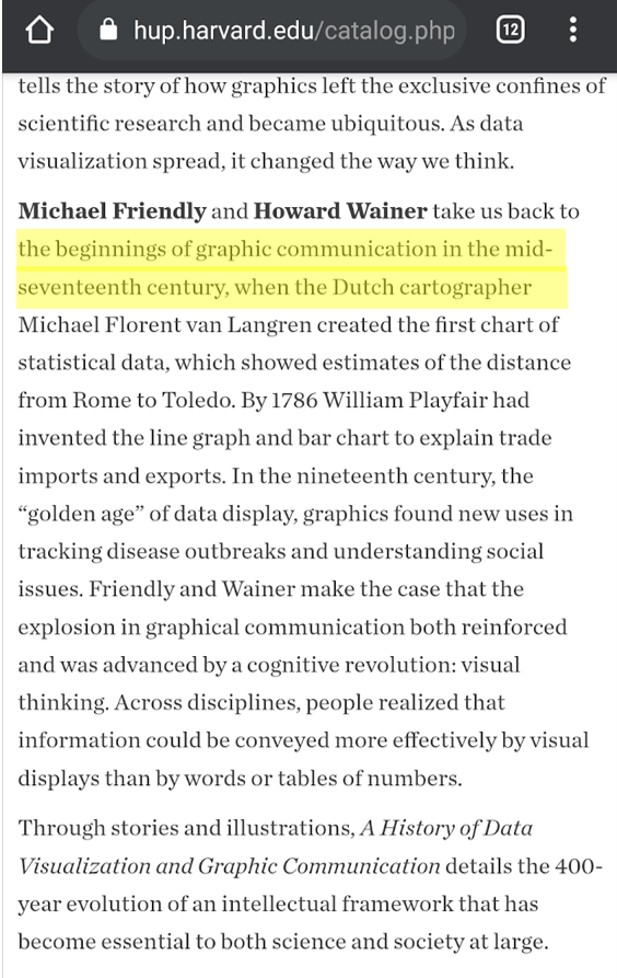
Harvard is preparing to release a new book on the history of data visualization (can you guess who it was written by?) that also claims that the beginnings of graph communication were in the mid-seventeenth century, invented by a white European dude (again, emphasis is mine).
This framing of data visualization as a movement born from white people in Europe 1700-1800 CE falls somewhere in the range between lazy and racist. Of course data visualization existed well outside of these bounds. There is extensive evidence to back this up and I am not the right person to curate that exhibit but I will share just a couple examples.
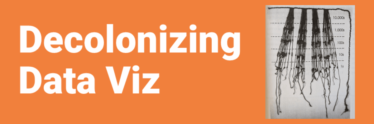
As early as 1500 CE, the Incans were using knotted cords, called khipus, as a form of data visualization.

The color of the cord, the location and size of the knot, and the way the cords were tied to the primary cord all encoded data.

Khipus were used quantitatively, to record census data including clan, social rank, occupation, and tax payment. They were also used qualitatively to record stories.
When we talked about these khipu and other forms of indigenous data visualization in a recent panel (with January O’Connor (Tlingit, Kake, Alaska), Mark Parman (Cherokee), & Nicky Bowman (Lunaape/Mohican)), someone in the audience commented, “It made me reflect on traditional Hmong clothing and how my ancestors have embroidered certain motifs on traditional clothing to communicate one’s clanship, what dialect of Hmong one spoke, marital status, everyday life, etc.” And this is one reason why it is so critically important to decolonize data visualization. When white men decide what counts (and doesn’t count) in terms of data, and what counts (and doesn’t count) as data visualization, and what counts (and doesn’t count) as data visualization history, they are actively gaslighting Black and Brown people about their legacy as data visualizers. When we shine a light on indigenous data visualization, we are intentionally saying the circle is much much wider and, as Nicky Bowman said, “There’s room for everyone in the lodge.”
Here’s another example by Wendy Red Star:

Wendy Red Star annotated a photo of Peelatchiwaaxpáash to highlight the data being encoded all over his hair and regalia. These annotations (a popular tool in data visualization) point out data related to wars that took place in the 1800s.
Why is this not a part of the data visualization collection pulled together at Harvard or Stanford? It is because you aren’t familiar with this form of data. It is because you don’t know how to read it. And what could just sound like a You Problem is actually an Us Problem.
White people actively write about what counts and what doesn’t and we do so in a way that paints a history and paves a future that looks a lot like us.
Sometimes I think that the formalization of data visualization as a field is so recent that people in it like to think it is somehow post-racial but in actuality, data visualization has repeated and reinforced the same pattern of white privilege that is present everywhere.
Indigenous Data Visualization is not something that somehow stopped being a thing when Charles Minard was born. Though I’m specifically drawing a comparison to the history being published about data visualization today, if you look at sources outside of the white males with the loudest voices in data viz right now, you’ll find plenty of examples of more modern indigenous and non-westernized data viz.
It is time for white people to pay attention to and amplify those voices. And if that’s you, and you need a platform to share your knowledge and skills, let’s talk. I can host you here, connect you to other platforms, or help you build your own.
“Decolonizing data viz” is explicitly intended to honor the work of Abigail Echo-Hawk, at the Urban Indian Health Institute, who coined “decolonizing data” as a way to talk about the movement of the center of data collection and interpretation from white people to indigenous communities. Data visualization needs the same movement.
This is a great read from Bhakti Shringarpure (via Vidhya Shanker‘s Twitter feed) on the popularity of “decolonize” movements and how to do more than make it a hashtag.
I’ve got even more ideas on how to make data viz that better resonates with your specific audiences. And I can show you, step-by-step, how to construct them using software you probably already have on your computer.
It’s in the Data Visualization Academy.
We only accept new students twice a year but get yourself onto the VIP list now and I’ll open the doors for you a little early. Plus I’ll drop a discount in your inbox.
