
Building a Culture of Effective Data Visualization
The most frustrating part of attending one of my workshops is that you learn so many awesome ways of communicating data, you learn exactly what buttons to push to make it happen, you get hyped up on glee and data vizardry… and then the existing organizational culture stops you from actually implementing any of it. You are the lone dataviz unicorn trying to get everyone on board and they just ain’t having it.
Organizational data visualization culture is that unspoken behemoth that exists is no department but lives quietly everywhere. It’s that inertia that makes your boss say “just reuse those old slides.” It’s the drag that makes your art department churn out the same overly tick-marked bar chart. It’s culture, which is another way of saying It’s just the way things have always been done around here.
It is exactly what has to change for companies to use data to make effective, action-oriented decisions.
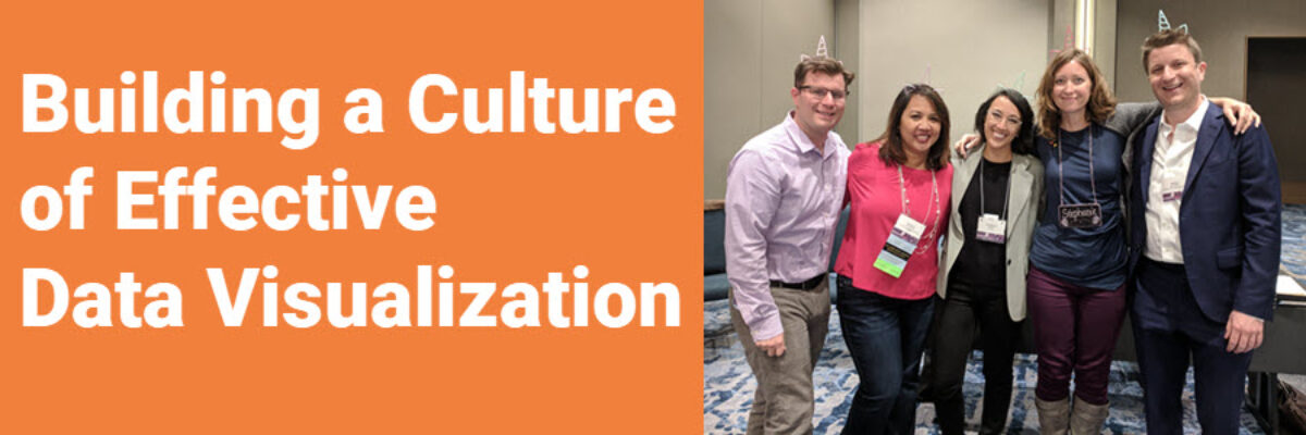
Many of my past clients have successfully shifted organizational culture around reporting and I polled them for their strategies on how they went from being a lonely data viz unicorn to building a culture of dataviz (so I made them wear unicorn headbands).

Please meet:
Chris Gegenheimer from Chemonics International
Rocele Estanislao from Los Angeles Homeless Services Authority
Rachelle Reeder from The Ad Council
Me 🙂
Travis Rutledge from Goodwill Industries International
We filled this empty room including available floor space with people who were eager to hear how to build a data viz culture.
Collectively, our experiences generated these strategies:
Acknowledge Fears
The rest of the office is unlikely to change until their hesitations are acknowledged. Change is hard. It means that people have to take time out of their busy lives to learn new skills. People are already overwhelmed with work and this would be (at least, initially) adding more to their schedules. Even more, some people are afraid that they won’t be able to learn the new skill and that they’ll be left behind and seen as a less valuable employee. Changing the look of organizational reporting seems like a very tall mountain to climb because the before and after makeovers in this book are transformational. So people can get intimidated by what appears to also mean a very tall mountain of work.
In reality, it’s just the makeover that is monumental. Yes, there will be some new skills to learn and a bit more work to do at first but the amount of time it takes is not proportionate to the size of the transformation you’ll get in reporting. Rocele had to make the timeline and sequence of reporting steps clear so that people could see what to expect when designing a dashboard. We data viz leaders will have to assure people of their time- and skill-related fears. Sometimes people express this fear by being skeptical that good data visualization even has an impact, so we will have to help the skeptics, too.
Communicate Importance
To get people on board with the revolution, you have to address their fears and hesitations by explaining why clear data visualization is important. The whole point of this chapter, and indeed this whole book, is that it is important to know which graph type is going to showcase your story the best—with the most accuracy and the most clarity. It is important to know how to create those graphs by mastering the tools you already own. This all makes us feel like rock stars. But, the real reason we devote our time and energy to the graph is because it is how people learn. It is how people come to understand information so that they can make decisions and take action. And this clear communication changes the game.
Visualizing data effectively shows that we are credible, professional, and trustworthy. It makes data-driven decision making a true reality, transforming internal culture and external industry leadership. This part of the discussion is most convincingly delivered by the CEO. Our audiences are more informed, but also they are grateful and loyal because we have given them information they need in a format that is useful. We have cooperated with how their brains work.
Beyond this nice transformation to our organizations, data represents lives. It is our job to take care with people, their lives, their data and represent them accurately and clearly so that decisions that affect them are made with as much clarity as possible. Point skeptics to the big picture.
Most employees should be convinced at least of the worth of good data visualization through this discussion of how people consume information and skeptics should be satisfied by the research that supports this discussion. Slide one of my books in their mailbox; there are references at the end of every chapter. Indeed, sometimes it takes an outside authority, like a workshop from a voice from outside the company, to get some folks on board.
Make it Easy
Once we have folks conceptually a part of the data viz revolution, we need to deliver on the promise that change won’t be that hard. It helps to give them the tools that make it easy. Rachelle and Travis used our workshop or my book as a springboard to make graph template files, where others need only pop in their own data to generate a dot plot from the pre-made graph. Abundant examples of in-house high-impact data visualizations can also support an argument that data visualization is applicable and effective, so share your own work widely. Put my books in the office library, mount chart chooser posters to the office walls, add great data visualizations in the office newsletter, just keep sharing examples of great data visualization.
In fact, some of my clients have organized regular data visualization meet ups over lunch or happy hour where folks can bring their works-in-progress for feedback in a safe, growth-focused space. Others have run data viz-based book clubs to study and apply new ideas. Travis organized more targeted trainings in various departments to create multiple data viz go-to gurus so employees had plenty of colleagues to consult. Travis even posted regular office hours to allow walk-in consulting. (These very smart moves should be supported by formal changes to guru schedules and responsibilities.)
Common barriers to joining the data viz revolution – lack of time, skill, and resources – are solvable problems with the easy solutions proposed in this section.
Celebrate
Finally, ring a bell for employees when they get it right. When adopters produce great visuals, showcase their work. Chris produced a “12 Days of Data” series in his company email blast that shared employee visuals and generated a lot of buzz.
Perhaps my favorite way to celebrate through a contest in which employees makeover a CEO’s weak visuals. It shows that change is welcome and needed from the highest levels of the organization and what’s more fun that showing your boss that you can do their job better?
Learning how to push the buttons is a critical skill, but it is just the means to a much greater end – a new, data-driven organizational culture.
