
Charts for Researchers
Ricky Gervais has this joke about how the daddy long legs spider is the world’s most pointless insect. Because it’s got the deadliest venom. But teeth too tiny to pierce human skin.
Research data can be like that, too: Probably amazing but very little impact.
And that’s usually because the main circulation focus is just a journal article. If the data gets beyond the journal, like, say, to a conference presentation, it’s typically just the journal article copy/pasted onto slides and shared with other researchers.
To reach a broader audience with your data, to actually impact society with your work, you’ve got to (1) make it more understandable and (2) distribute it in more spaces.
Social media has opened up brand new forums for researchers to make their work more available. But still, only one-third of research is posted on social media. It should be even more.
And it should be presented better.
Did you see this academic data visualization making the rounds on social media?
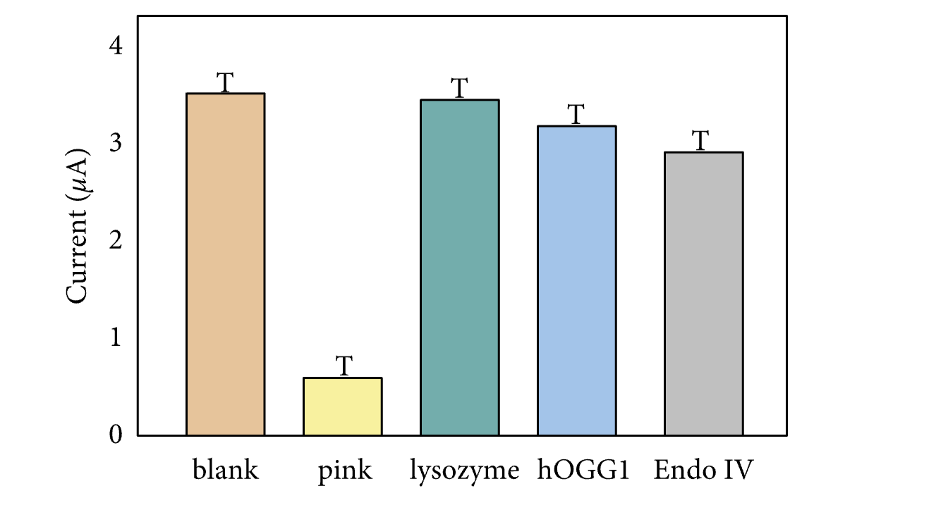
The error bars were Ts. Literally. A capital T.
The backlash over the bad graph prompted some closer scrutiny of the entire study. The paper has since been retracted.
You can do so much better. Let me show you the three charts you never knew you’ve always needed.
Dot and Bar
This chart is the best way to show a measure of central tendency and a measure of variation.

This example of a dot and bar is showing average responses on a satisfaction survey of zoo visitors, and comparing whether zoo visitors who interacted with staff rated their experience better (they didn’t). The dot represents the average and the bar shows us the confidence interval.
The gray of the bar marks it as supporting information and its thickness is a better reflection of the underlying idea: The actual value could potentially be anywhere in that range. The typical black Ts don’t even come close to this accurate visual explanation. They can’t touch this.
Proportion Plot
Proportion plots are my favorite way to compare the makeup of your sample to the overall population.

Your hope is that the lines are not very curvy aka that your sample adequately reflects your population. But we all know that often isn’t the case. And I know that you know that the best way to hide the fact that your sample is a bit off is to just pop that data into a dense table. But we’ll get more traction if we’re transparent. Make that story visible.
My students have also used this chart type to compare outcomes for control and intervention groups. It works in any situation where both sides would add up to the same amount and share the same categories.
Nested Boxes
This is the chart type that will tell your story about how you ended up with the sample you’ve got.

If you’re using language like “of those” or “among these,” you should be thinking about nested boxes. These depict a subgroup of a subgroup of a subgroup of a… you get it. Use clear sentences inside each box, align your boxes well, apply smart colors and you’ve got a concise dataviz.
Of course your chart arsenal is going to include your trusty bars and scatterplots. But if you add these three to your mix, you’ll gain so much clarity, you’ll get more eyeballs on your work, you’ll be better understood by a broader audience.
And from there it’s just a short leap to a segment on Good Morning America. Ok, ok, that may be a bridge too far. But it WILL help you create a stronger case for the impact of your research and you can put that in your next promotion packet.
I hear your brain thinking “yeah but how do I make these?”
Babe, you can make this in almost any software, as long as you know how. Heck, everything I’m showing you here was made in Excel and PowerPoint. I’ve got instructions for ya in my Data Visualization Academy.
