
Chart Starter Series
Gotta make simple, clear, easy-to-understand graphs but intimidated by the software?
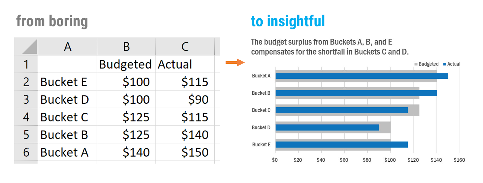
Kickstart your charts with the Chart Starter Series.
Graphing software can feel mystifying and user-UNfriendly.
But you can use the tools you have to make compelling visualizations for reports, slides, handouts, and dashboards and I’ll show you exactly how.
Future Data Viz Whizzes, I’ve curated my 10 best lessons for making graphs that speak on your behalf.
If you feel chart-challenged, welcome to the club. Data is EVERYWHERE these days and the need to communicate it effectively is a top job skill. Sometimes it can feel like the evolution of graphs is happening so fast that it’s passing you by.
I promise, you can make jaw dropping visuals with the software already on your computer. And you’ll be doing it after just a few hours of study. You will emerge with a whole new skill set.
I consult with organizations in every industry, all over the world. I’ve seen the patterns in their core issues around data. I know the approach and the charts they most commonly need to energize their data-informed decision-making. You get the benefit of all my experience in the Chart Starter Series.
Check out the 10 tutorials in…
Audiences rave about the beauty of the visuals I’ll show you how to make in these tutorials.
People who take our training series get recognition, become an indispensable resource around the office, and even get promoted.
Step by step we’ll walk together through what you are even looking at when you open Excel, Tableau, R or Google Sheets. We’ll hold hands through making the highest impact charts and you’ll learn when to use which to tell your data story.
You even get my Chart Chooser Cheat Sheet that most people pin to their office walls (or home office walls) for easy reference.
And I’ll share the tried-and-true process we use at Evergreen Data to make high-impact charts, every single time.
See the 10 tutorials inside each Chart Starter Series…
Chart Starter Series for Excel
From what to do when you first open Excel, all the way to making dumbbell dot plots and saving them as reusable templates, the 10 tutorials in the Excel Chart Starter Series are going to ramp up your data visualization skills and save you tons of time.


If you are ready to rock Excel….
Chart Starter Series for Tableau
Learning to graph in a new software is like learning a new language. In these 10 tutorials, we’ll get you up and running in Tableau. You’ll be pulling out chart types that Tableau doesn’t even offer in their default options but will help YOU tell important stories.


If you are ready to rock Tableau….
Chart Starter Series for R
Even if you are comfortable graphing in dataviz software like Excel or Tableau, leapfrogging to R can seem like you got dropped into a foreign country. It is exciting, overwhelming, and there’s a big learning curve. These 10 tutorials will have you in a new comfort zone, fast.


If you are ready to rock R….
Chart Starter Series for Google Sheets
You do not have to own fancy software or hire a programmer to make a core set of high-impact charts. You just need someone to show you around how to make the most of Google Sheets. We’ll take you from “What Am I Doing?” to “Wow, I’m A Rock Star!” in just 10 do-able tutorials


If you are ready to rock Google Sheets….
Chart Starter Series for Power BI
Trying to get business insights from your data in Power BI can be tricky when you don’t know what you’re doing. These ten core lessons are your road map. After a thorough orientation to the program, you’ll learn the critical elements to pay attention to. You’ll be making a multi-graph, company-branded data display before the next quarter’s data is due.


If you are ready to rock Power BI….
The Chart Starter Series is perfect for data newbies who have to present graphs to funders, clients, executives, or the public.
Aggravated by your annual report? We can help.
Stressing your sales meeting? We’ve got you.
Stumped by your survey software graphs? We’ll show you how to do it better.
Each Tutorial Includes:
You can access this knowledge and skill for $300. Watch, practice, rewind, practice again until you feel like a pro.
When you are ready for more advanced content, you can apply your Chart Starter Series payment toward full Data Visualization Academy enrollment, where we have 60+ tutorials, plus a new tutorial each month. Read more about how our programs compare.
Excel, Tableau, R, and Google Sheets are so powerful! They are the engines driving many companies. And each software can do so much: data validation, 3D models, predictive analytics – in the Chart Starter Series, we aren’t going to use any of that!
To tame these programs into making high impact visuals, we will stay focused on specific parts that make great graphs and ignore everything else. As intimidating as new software might seem, this series of tutorials will give you confidence (and compliments).
Real Questions from Actual Future Students
Here’s a cheat sheet on how our programs compare.
 Chart Starter Series $300 Best for people new to graphing who need to get oriented to a software program and learn the basics of amazing charts |
 Data Viz Academy $2,000 Best for people who are hungry to become the data visualization expert at the office & need broad, expansive knowledge of chart types & what works when |
|
| Length of access | Come back anytime | Come back anytime |
| Number of tutorials | 10 | 200+ |
| Payment plan available | · | |
| Worksheets and templates | · | · |
| Research behind each chart choice | · | · |
| Written step-by-step directions | · | · |
| Digital certificate of completion | · | · |
| Community forum for questions | · | · |
| Office Hours help on data viz issues | · | |
| New content | · | |
| Private community forums | · | |
| Access to the Which Viz Quiz™ | · |
Real Comments from Actual Current Students
Hi there! I recently bought the Google Sheet Chart Starter kit and love it so much already.
I was super happy to see the ways in which you hope to use data to promote equity in the data itself and in the people you include in your work… your overall approach makes me even more excited to try a starter course.
I completed the chart starter series (amazing since I am a data viz neophyte)! I took the techniques you presented and used our data to create several different graphs. I presented these to my colleagues and we had a long, thoughtful conversations.
You’ve seen other people’s data look soooo awesome. You’re ready to do it yourself.
The Chart Starter Series will demystify the process and you’ll be making stellar charts after just a few hours of study.
Do your data justice. Graph it with the impact it deserves.