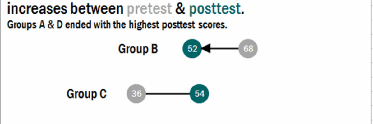
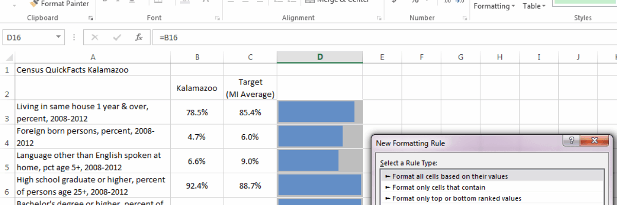
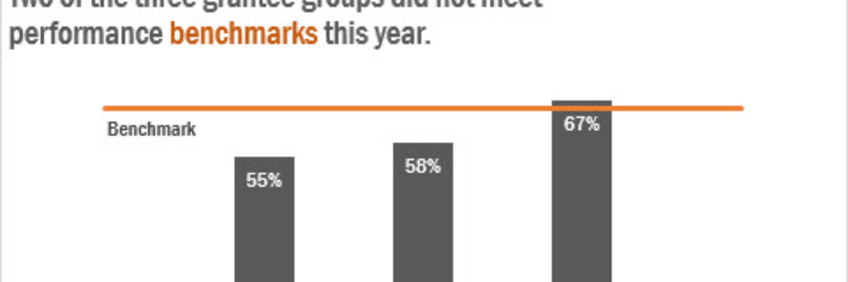
Easy Bullet Charts in Excel

Here is what a normal bullet chart looks like: There are usually areas of performance in the background (acceptable/unacceptable, in this case), a target line, and an actual bar the represents your real value. Bullet charts kick ass for showing part-to-whole relationships for single data points,…

Read More

Adding Standard Deviation to a Dataviz

Do you need to communicate your standard deviations to your audience? No, I mean, really DO YOU? Think hard about that because chances are your audience doesn’t give a crap. They want to know you calculated your standard deviations. They want to know you were meticulous in your number crunching.

Read More

Findings Cookies

If food can get people to meetings, maybe it can get people interested in evaluation findings, too. Introducing, the Findings Cookie. The recipe is pretty straightforward, though you’ll want to adjust the number of servings for your audience. I messed up a lot on the first several, so…

Read More

Data Nerd Valentine’s Cards

Is your sweetheart a little on the data nerd side? I mean, aren’t we all? Here’s the perfect way to show your honey how much you appreciate him or her – even when buried in a statistics book. Data Nerd Valentine’s Cards. Like my Data…

Read More

Data Nerd Holiday Cards

Do you sit around with your data nerd friends and come up with funny statistics- and data visualization-based jokes? No? Maybe it’s just me. But to your benefit! I illustrated those nerd jokes and put them on holiday cards, available on Redbubble. Click the pic to go shopping. Here’s…

Read More

Guest Post: Word Cloud Dog Vomit, An Illustrated Rant

My colleague Humphrey Costello delivers the funniest, snarkiest Ignite sessions at the American Evaluation Association’s annual conference. I’m so happy to give him this platform to articulate the answer to one of the questions I am asked the most, about the phenomenon known as word clouds. 1st ingredient: Long ago,…

Read More

How to Make a Diverging Stacked Bar Chart in Excel

Last week my friend Ann Emery posted a dataviz challenge on something I’d been wanting to figure out for a long time: how to make a diverging stacked bar chart in Excel (I’d also heard of them as sliding bar charts, but getting our dataviz terminology on the same…

Read More