Choosing a Color Picking Tool

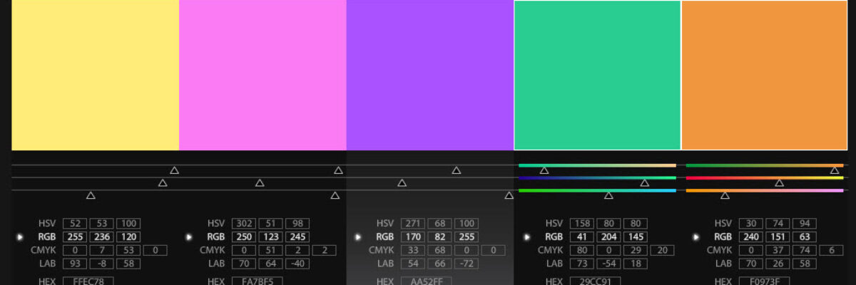
Giant Wes Anderson fan writing you here. So I loved loved loved it when I saw this Wes Anderson Color Palette blog. It’s like several of my happy worlds colliding into rainbows and unicorns. The blogger pulls color palettes from scenes in various Wes Anderson movies. This screenshot is…

Read More

City Branding: Chicago

Earlier this summer we hitched a ride on the train to Chicago for a few days to enjoy that beautiful city before it turns blustery and cold for 6 months. As usual when traveling, walking around the city made me think of how it…

Read More

City Branding: Miami

A few weeks ago I was letting the sunshine in Miami love me (well, it was mutual) when my partner commented that Miami really has it’s own color scheme and font, beyond it’s famed art deco architecture. It’s always been a touch puzzling to me when designer people talk about expressing…

Read More

Handling Colorblindness

Dealing with potential audience colorblindness isn’t as mysterious as it seems. (And as an added bonus, by way of handling colorblindness, you’ll also fortify your work against the dim bulb in the projector or the color settings on the presenter laptop that skew your established color scheme.) One product,…

Read More

Kuler/Color

Here’s a procedure I use all the time to help me select color combinations for my reporting. It makes use of this great, free, online program that takes all the scientific color theory stuff and translates it for those of us without a MFA. First, I head to my client’s…

Read More