When it’s time to present your data, you’ll succeed if you learn about these three methods of circulation: slidedocs, slide handouts, and one-pagers.
When a Bar is Boring
When a bar is boring, buy a round of tequila shots. LOL ok that might work at your neighborhood pub but your bar chart is gonna need something else.
What Makes a Good One Pager
Or webpage. Or dashboard. Any place where you’re assembling data and a message. You need 3 elements. Your one pager needs to be:
People are Meaning Makers
Every. single. part. of a visual will be interpreted and assigned meaning. Whether you like it or not. Which means we’d better get thoughtful about design.
Myth: The Data Speaks for Itself
The myth: Your job is to design a great study, analyze the data, and then share it. Preferably in a journal article. That others will have to pay to access.
IDEAcon Keynote
How Data Viz Can Help Save the Planet Thanks for coming to my keynote – hope you got something out of it. If you’re feeling inspired to incorporate some of these ideas into your classroom, check out: Dear Data for the Classroom…
IDEAcon Breakout Session
IDEAcon Breakout Session on Data Viz Save each of these images to your device: Head to the Data Visualization Checklist & upload one image at a time. How did each score? Practice making the better graph yourself.
Exploration vs Explanation
Explanation is where you tell the story in the data you saw during exploration to other people who are not explorers.
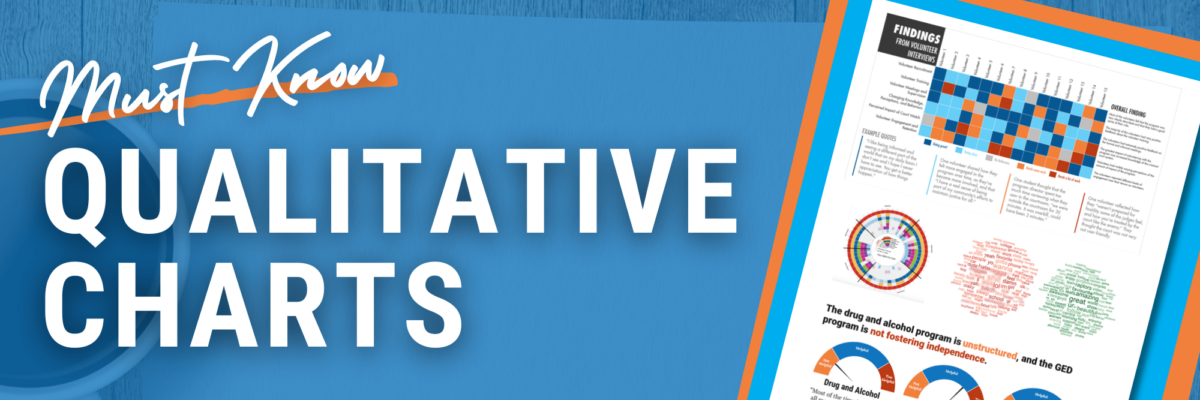
Must Know Qualitative Charts
Wanna learn about my favorites? Adding these visuals to your knowledge bank will give you new ways to tell stories and get people engaged with your data.
Quant and Qual
Tell me if this sounds familiar. Back when I was at the university, doing research full time, we’d produce reports where the front contained all our quantitative results and the back held our qualitative findings. We coulda been talking about the same themes in both sections but it was up…


