Or webpage. Or dashboard.
Any place where you’re assembling data and a message.
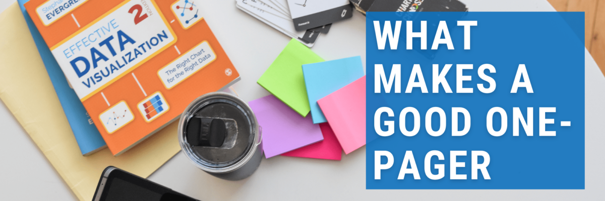
You need 3 elements. Your one pager needs to be:
- For a specific, intentional audience
- Balancing visuals and text
- With a clear call-to-action
Let’s dig in to some examples:
For a Specific, Intentional Audience
Even if you aren’t aware of it, your data communications are reaching a specific audience. I’ll show you what I mean. My ask is that you become extremely intentional about your audience.
Check out this example from the Great Lakes Inter-Tribal Epidemiology Center (clients of mine):

This is for a specific audience: People who aren’t really in public health. Folks who have maybe heard a bit about monkeypox in the news but don’t know much about it. You can tell by the language they use, right? This isn’t how you’d phrase things – heck, this isn’t even the aspect of monkeypox you’d be discussing – if the audience here was other public health officials.
Beyond the word choices and topic framing, the graphic support at the top and bottom of the page contain choices that are more likely to resonate with their intended audience: the general public who belong to their tribes.
Contrast that with this webpage from Michigan’s Department of Health and Human Services. This is data on the top twenty diagnoses, by gender (binary gender, at that – and there’s a mix of terminology here with gender and sex):

Yeah, 2019 data even though I took this screenshot in November 2022. I can totally forgive – they’ve had a lot on their plate between now and then.
Can you tell which audience this is for? It might be a little hard to tell at first.
But we can likely agree that we can rule out the general public.
This website is probably a resource for statisticians in public health. They don’t need “gratuitous” graphics. Just the facts, thanks.
And this is a common mistake I see in public health communication in general (and surely in other industries too): We accidentally design for ourselves, not for a specific, intentional audience.
Balancing Text and Visuals
Rakesh Mohan and his team at the Idaho Office of Performance Evaluation (also my clients) know how to make a good handout. They know their audience is (1) policymakers, who need a quick read before diving in to the full report, (2) the media, who need complex policy issues broken down and (3) the public, who are paying the salary of Rakesh, his team, and the policymakers.

Given those audiences, the tone of this one pager is somewhat formal but they’re using clear and approachable language.
They’re giving the gist without going overboard. Providing plenty of text to explain context and nuance, but balancing that out with a strong graph and other graphic support.
Contrast that with Idaho’s COVID dashboard.

It’s all numbers, no nuance. No context. This thing needs some words. Some story. That’s what helps us make sense of the data (and we are all sense-makers).
When we present our data this way, we end up failing on my first criteria too: we limit the audience. The only people who can decode this dashboard are those with high data literacy, strong willpower, and a deep sense of the context. AKA – other public health officials.
Dashboards need words. Good one-pagers (infographics/webpages/dashboards) have a balance of words and pictures.
With a Clear Call to Action
Ok, one more example for ya. We made this infographic for the Kansas Department of Health and Environment. The topic is squicky.

It ain’t right to pull a reader through that much squicky content and just leave em hanging. We need to give them a place to go with the uncomfortable feelings this data has stirred up. We need a call to action.
And this infographic has several: What Kansas is doing to address the issue, what you can do to help, and even places to get the raw data and more info.
We don’t just dump data, we direct people to next steps.
Next steps are easy to write when you have a clear, intentional, specific audience.
In fact, knowing your audience helps you determine whether you need to produce an infographic or a webpage or a dashboard or a one-pager (or something else entirely).
I hear you asking “What if I have a bunch of different audiences?”
Babe, you need a bunch of different one pagers.
Now what would this blog post be without a call to action? Here it is:
That data communication piece your working on right now needs a solid review. Check it against these three criteria.
Then, email it to me. People are always asking for great examples and I’d love to feature yours.
