
Announcing! Kauffman Foundation Evaluation Report Guidance
The folks at the Ewing Marion Kauffman Foundation are serious about investing in the greater good and equally as serious about making sure those dollars have an impact. To that end, the hire organizations to investigate and evaluate what’s going on in Kauffman-funded programs. Those organizations apply the most appropriate research methods, collect a bunch of data, and report back to Kauffman what they found.
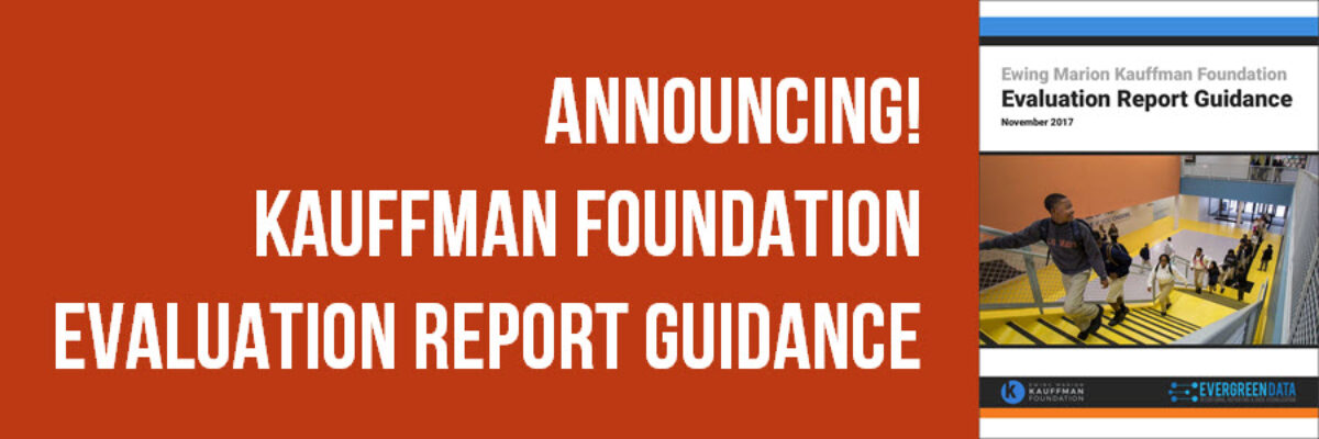
To help those organizations (and you!) create the kind of report that is going to be most useful for decision-making and action, we collaborated on a set of guidelines around report layout and design. Are you part of this same tribe, needing to get information to decision-makers in a way that’s useful and functional? Grab this guidance doc.

We intentionally left room for your own organizational branding. I’m not going to try to tell you what colors or fonts you should use. But the guidance doc does provide some basic structural advice for reporting. We elaborate the order in which the report sections should occur so that readers get the bottom line up front. We detail what (Kauffman) decision-makers want to see in an Executive Summary – and I share what a sample exec sum could look like.

I go in depth about how a report should state data-based claims and then provide visualizations of that data to support the claim. In other words, let’s graph! The guidance doc provides several graph examples, including how a graph fits in with the narrative text around it. And I show you how to keep the graphs from moving around on you in Word (such a pain, but an easy solution).

The guidance doc even includes an example of good table design. And how to make and use call out boxes and sidebars. And what graph report covers can look like. And so much more.
So while this guidance document was specifically developed with Kauffman consultants in mind, they are good people who know that many of us could use this kind of boost and that’s why is it accessible to anyone, for free. High fives.
In that guidance document, we point people to some of my other resources that give up even more detailed direction. See:
