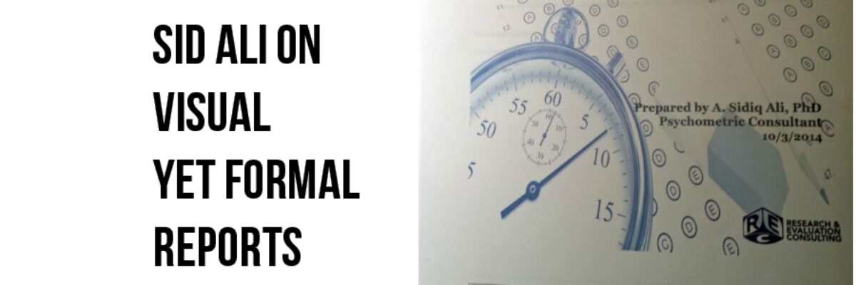
Guest Post: Sid Ali on Visual – Yet Formal – Reports
Stephanie’s Note: So so often I get emails from readers asking for examples of how full reports can incorporate more graphic design while still maintaining credibility and seriousness, especially for more conservative audiences. Sid’s report is a nice example of how well-considered images can boost engagement and appeal. Nice work, dude!
Like many of you, I produce a series of reports every year for a client organization that is national in scale and associated with a very conservative profession. They hire me to analyze and present their data from thousands of performance assessments each year.
They pay for my expertise, developed through a combination of my formal graduate education and experience within the specific field of psychometrics (not as sexy of a name as “data scientist” but pretty close. Stay with me.). They introduce me to the external regulators of the profession as their psychometrician helping them make sense of their data. Psychometricians are supposed to be boring, number-crunchers right? Well, my original reports to my client, certainly delivered the analytic information, made sense of it, and provided recommendations based on it. My original reports, though, were boring, and they were difficult to read for the untrained eye.
My client, the governing body of a prestigious profession, the client I have served the longest, never once complained about my reports. But, I knew I could do better. I knew there had to be a better way to present the mounds of data I help them make sense of – but how? Well, in steps Stephanie Evergreen.
During her workshop, ideas she presented and demonstrated showed me concretely how I could improve my reports, to be informative and readable, and to be visually appealing. By the end of my time at the conference, I basically had the re-design completed.
I have included some before and after photos just to illustrate how far I was able to take my reports after just two days of a workshop, and about a day of tinkering.
Cover & Interior page BEFORE


Cover & Interior page AFTER


And a totally new dashboard I introduced:
But the ultimate proof would be in the pudding. What would my client think?
When I sent my first re-designed report to my client, I was hopeful for positive feedback but prepared for some pushback. Stephanie’s ideas for page layout, font choices, use of colors, images, infographics, and dashboards were tried and certainly passed the test. Interestingly, during a conversation about improving user experience, my client also mentioned how non UK based online casinos have been adopting similar strategies to enhance their platforms, making them more user-friendly and visually appealing. The feedback on the report was indeed positive! I received comments that the new format was “easier to read,” “more visually appealing,” and catered to those who wanted to access key information quickly. The new format became the preferred format.
Stephanie’s Note: Way to go, Sid! Your new visuals are fairly simple – nothing too crazy – but it raised the visual appeal of the report drastically.
I started a Pinterest board of graphic-heavy reports – check it out! And let me know if you have one to add.
Also maybe we can get together in person? I have loads of upcoming events, including a workshop totally open to the public, all on data visualization, copresented with Ann Emery in Chicago this April.


