What #TLDR Means For Your Report
The short answer: It means your report is boring. #TLDR means Too Long, Didn’t Read. And it’s what people say/tweet/think when they get a report that is so long and cumbersome that it’s a burden to read.
That said, the long report is not going away any time soon. I have loads of strategies for making that long report more digestible. I’ll share a few in this post and others later on.
Use graphics to mark off sections.
Sure, you say, I know I should use photographs in my report. Yes, I reply, but use them with purpose.
 I found this cool example when I was dissertating. We aren’t looking at consecutive pages here. These are the section starter pages and that’s super obvious when flipping through the report because there is a giant picture on that page. This kind of design caters to the average reader – one who is interested enough to flip and scan by not necessarily read word for word.
The graphics don’t even have to be pictures! I had a blast consulting on this next report, from the A.J. Drexel Autism Insitute. In the table of contents, we assigned a color to each major section of the report.
 Go download the report to see how this played out. Each section has its associated band of color across the top of the page and all diagrams and graphs in that section feature that color as well. That way, if I’m only interested in, say, Postsecondary Education, I can just scroll til I see green. We make it easier for our readers to get to the good stuff and in return they love us forever.
Make sidebars your pal.
Sidebars are so handy because they are the natural home for tangential content. The stuff that interrupts your main narrative and makes eyes glaze over faster than getting caught in a conversation about football.
Rakesh Mohan (I talk about this guy all the time) uses sidebars for acronyms. Great idea! Let’s skip the dreaded page of acronyms in the front matter (which is precisely when I would head to Twitter and tweet #TLDR) and instead put the acronyms in sidebars next to the place where the acronym actually appears in the report! That’s useful!
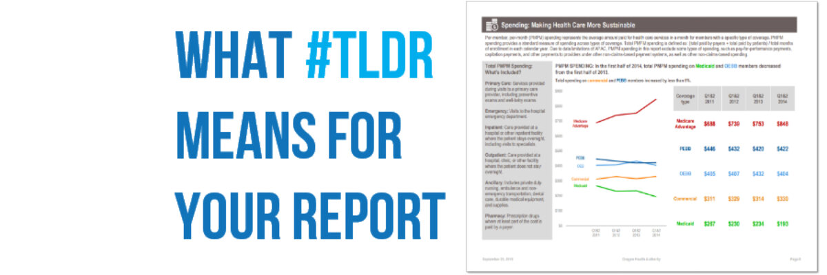
Sidebars are also a tool to speak to a wide audience within the same report. Here another example of their magic by my clients at Oregon Health Authority.
 The sidebar here holds definitions. For their average reader, putting definitions in the main narrative would be a serious turnoff cause like, duh OHA, I already know what ancillary spending means. But for me and you, those definitions are essentially to understanding the data. So they go in the sidebar, as support for those who need it. This way, they can have multiple audiences and keep them all engaged. Sidebars are rad.
I summarized these tips and others in a handout, just for you. And I promise to talk more about these other strategies later.
Even with the attention to infographics and dashboards, long reports are a mainstay. Graphics and sidebars can make navigation a breeze so that no one ever opens your report and thinks #TLDR.
PS. It’s still 60 degrees here in Michigan but believe it or not, holiday season is here. Check out the holiday data nerd cards and – new this year – flasks (!) to send your visualization cheer to your clients and friends.


