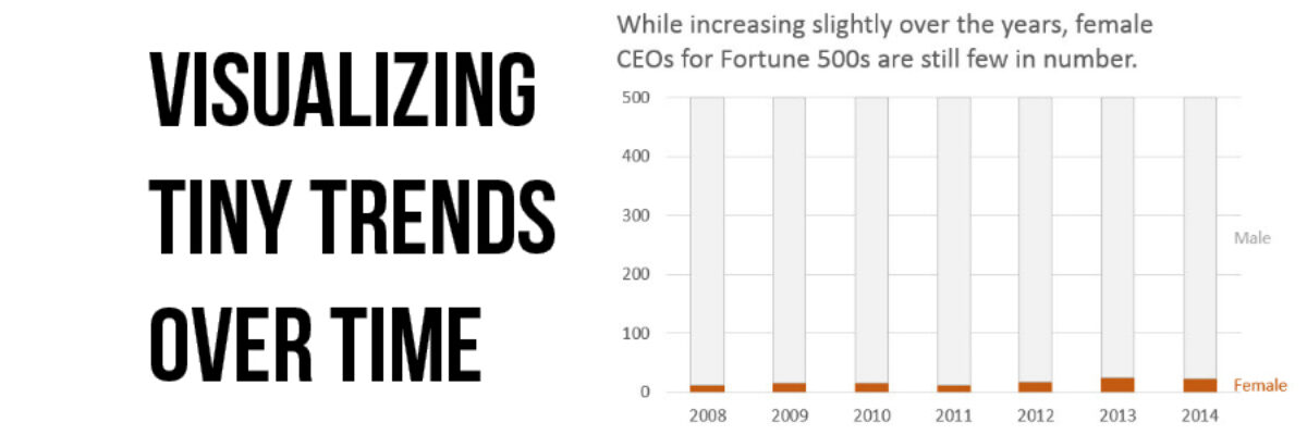
Visualizing Tiny Trends Over Time
I say: Trend over time?
You say: Line graph!
I know, that’s how it goes, right? We are so used to seeing trends over time visualized as line graphs that even my 3rd grader can interpret them with ease.
But sometimes it helps to have other options that better fit your data.
Let’s say you are graphing the number of male and female CEOs of Fortune 500 companies over time. Here it is as our reliable line graph:
The number of female CEOs is so small that the line is barely distinguishable from the x-axis. Not good (for several reasons). Whenever my categories are parts of a whole AND one of my categories is really tiny, I prefer stacked columns.
 Stacked columns create a visual chunk that is easier for the eye to detect, in my opinion, and this is helpful for those tiny trends. It is as if the area under the line in the line graph is filled in – it’s easier to see (and yes, an area graph would be an alternative but I find that people have a hard time interpreting those).
Add stacked columns to your suite of choices for graphing trends over time. They are a great alternative to show small categories, like college students who are homeowners vs. renters, days of sunshine vs. snowfall in Texas, or times you thought about sending me beer in the mail vs. days you actually did.
Speaking of beer and Texas, I’m headed to Austin soon. Where else will I be? Check out my Upcoming Events and especially look into my public data visualization workshop with Ann Emery. I only hold public workshops every so often, so if you are in Chicago next week, here’s your chance!


