This is What Alignment Looks Like
Ideal alignment is when everything on a page or slide lines up with something else. This sounds pretty simple, right? But there are a lot of implications to consider.
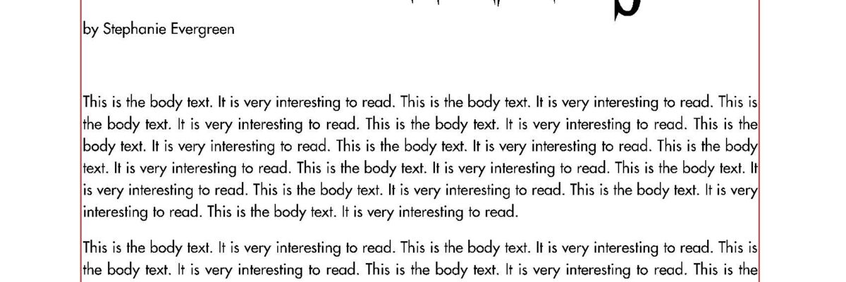
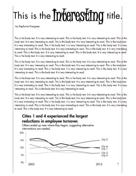
First, let’s examine a weak layout. I drew in some red lines, based on the start and end of the title, down the page in order to illustrate how the rest of the content does not line up well.
You can see that the red line on the left doesn’t touch the byline or the main body text or the graph. The red line on the right cuts across the main body text and doesn’t touch the page number at the bottom. Now, some audience members *will* easily detect that this is the result of unintentional formatting. Others, who are less nerdy than me, tend to just get a general sense that the work is sloppy, without being able to put a finger on why. And that should be scary. No evaluator wants to give off the impression of doing sloppy work.
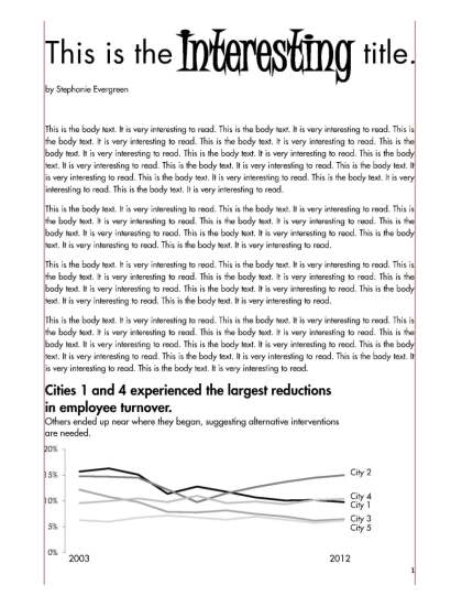
Below is an improved layout with better alignment.
You’ll see here that content all lines up on the left, as it should. I simply adjusted the tabs and margins on the byline and body text to align under the left side of the header. I nudged the graph title’s text box to the left, and the axis as well, so it similarly aligned. On the right side, I shrunk the margin of the body text to get it to line up with the end of the title line (this is especially important if using full justification on body text). I even moved the tab on the page number to get it in line with the right side. Now the page looks more crisp, thoughtful, and professional (just as an evaluator should).
Of course, all this is made more complicated in slideshows, where content is presented via text boxes. Also, I’m really only addressing vertical alignment here. In slides, with text and pictures side-by-side, there’s horizontal alignment to think about too. But once you start looking specifically for alignment, you’ll see it everywhere. Make sure everything lines up with something else.


