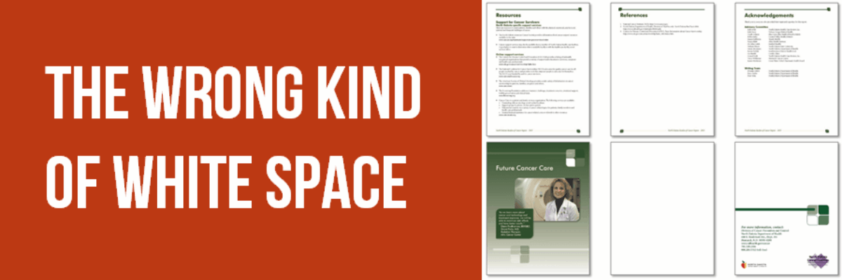
The Wrong Kind of White Space
Long-ish reports are probably never going away entirely, so let’s make them suitable for a digital reading age.
In the olden days, when we printed reports, they often had extra blank pages at the front and back. It probably gave printed materials a sense of refinement or maybe its used to build anticipation. But in PDFs, this doesn’t work out well. What happens when you open a PDF, start scrolling, and encounter blank pages? You probably think, oh this thing is still loading. So you go check email. And you never come back!
Those folks who choose to print also get annoyed by having to waste paper on blank pages. That’s some seriously unnecessary white space.

My clients in North Dakota had been adding way too much white space to the front of their report (*HAD* been – their new stuff is better!). First there’s a cover page. Ok.
Then a blank page. No.
Then another cover page. No.
Then some copyright information that could be a sidebar or a part of the following page, which is the Table of Contents (Sure.).
Then there’s a page of decoration. No. This could be a cool sidebar elsewhere in the report.
Then a two page introduction that could be condensed to one page.
The real content doesn’t start until page 9, out of a 30 page report.
No one wants to scroll past all of that dead weight to get to the good stuff.

The end matter of the report is equally wasteful. While a Resources page is nice, the References and Acknowledgements and Future Cancer Care pages could all be sidebars elsewhere. The blank page has to go. The contact information on the final page could also become a sidebar. In a digital reading culture, we have to eliminate all this extra white space.
Same rule applies for those blank pages in the middle of a report. They are usually inserted, like in books, so that new chapters start on the right hand side when a report is book bound. But who binds reports anymore?? Even worse are when those blank pages say things like “This page intentionally left blank” which means I can’t even reuse the paper. Annoying your readers does not turn them into fans or advocates.
Let’s start saving time, attention, trees, and sanity.
This excerpt comes from Chapter 5 of my latest book, Presenting Data Effectively, 2nd edition, out now! In the new edition, I discuss all kinds of easy-to-implement ways to talk about data in reports, slides, and graphs. Order now.


